Towards the end of the Han dynasty (漢朝, 206 B.C. – 220 C.E.) and first years of The Three Kingdoms period (三國時代, 220-280 C.E.) calligraphy became a major form of art in China. Two styles matured: clerical (隷書, reisho) and cursive (草書, sousho), and a new one emerged on the horizon – standard script (楷書, kaisho).
The legend says that kaisho was created by a minister of the Cao Wei dynasty (曹魏, 220 -265) named Zhong Yao (鍾繇 151-230), after years devoted to perfecting his brush techniques, and deeply influenced by a book written by Cai Yong (蔡邕, 133-192 C.E.), titled “Nine Forces Essay” (九勢, Jiu Shi.)
Still, the creation of any script (perhaps with exception of flying white (飛白, kasuri) cannot be attributed to one person. The earliest records of pre-kaisho are bamboo books (木簡, mokkan) from 170 B.C. unearthed in 1972 in Hunan province (湖南). They represent a clear transition from reisho to kaisho, where both of its most characteristic features (“silk worm head” and “goose tail”), were simplified into a straight and simple, yet still thicker than other, lines.
During 4th century C.E. calligraphy flourishes and its importance is growing, eventually to become one of only six subjects at the National Academy during the Tang dynasty (唐朝, 618 – 907 C.E.). Shodo became a tool for selecting talents and evaluating people, laying foundations for the modern science of graphology, leading further to development of studying human psychology and behavior reasoning or prediction through handwriting analysis.
There are countless forms of regular script. Some are very powerful, strong and massive, yet well balanced, where others are more agile, fresh and springy, resembling a light weight boxer getting ready for the first round.
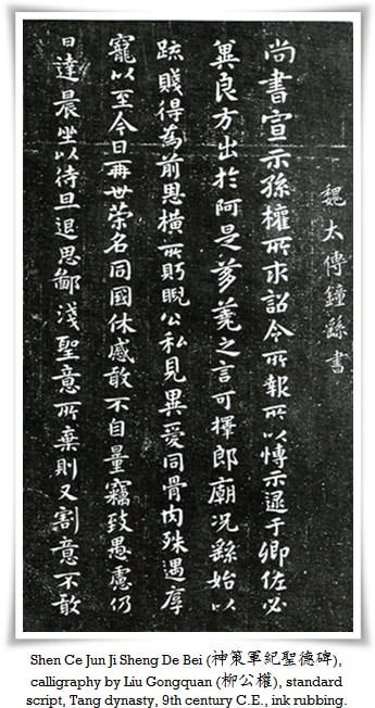
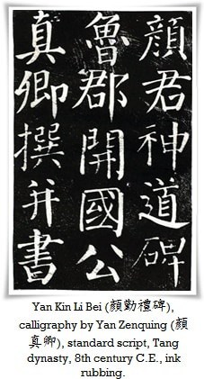
One of the most powerful and radiant styles was developed by a politician, Yan Zhenqing (顏真卿 709-785). His kaisho was as mighty as an iron tower, omnipotent and proud as mythical Huang Long (黄龍, Yellow Dragon). Studying his style always means a great adventure for me, as well as phenomenal training for controlling the tip of the brush.
Characters in kaisho have a rectangular form, and are governed by very strict rules of writing. There are many calligraphic theories, but one of the most important is 永字八法 (eiji happou, lit. “eight laws of the character 永”, which means “eternity”) developed by the Buddhist monk Zhi Yong (智永, birth and death dates unknown) from the Sui dynasty period (隋朝, 581 – 618), who was related to calligraphy sage Wang Xizhi (王義之 303 – 361).
永is an extremely important character in both Chinese and Japanese languages. It is not only a synonym of endurance and perseverance, but also includes eight fundamental brush strokes, so called eight rules (八法, happou). All in all, there are thirty seven brush strokes in total applied in kaisho, however 29 of them are derived from the basic 8, and these are:
- 側 (soku) lit. “vicinity”. It is also referred to as 点 (ten) – “a dot”, or 怪石 (kaiseki) – “oddly shaped stone” (from its appearance of a rounded rock). There are dozens of ways of writing dots and despite the fact that it may not seem to be a demanding brush stroke, it is in fact extremely difficult to write expressively.
- 勒(roku)”a halter”, also referred to as “jade table” (玉案, gyokuzuki) of smooth and even surface. It’s a slightly ascending vertical stroke with a strict beginning and end, where the movement of the brush is compared to the abrupt pull of the rider’s reins to stop the horse.
- 努 (do)means “to exert”, although the lower part of this character (力 chikara, i.e. power) was once written as “a bow” (弓, yumi). From this, an image of a stone shooting crossbow ready to fire 石弓 (ishi yumi), was derived. The stroke ends with an immediate halt, imitating the crossbow mechanism lock. The left-hand-side of the vertical stroke in the character 永 ought to be gently curved inwards, while the right hand side stays straight. The skillful manipulation of the brush pressure against the paper is the key here.—This vertical stroke is also known as the 鉄柱 (tecchuu) – “iron pole”, from its solid and rigid appearance.
- 趯 (teki)suggests “lifting”, or “a hook”, also referred to as 蟹爪(kaisou, i.e. crab pincer) from its upturned shape. The difficulty in writing a perfect teki is that its gradually thinning line needs to be delivered in one smooth consistent stroke, without losing vigor.
- 策 (saku, horsewhip), or虎牙 (koga, tiger fang). Saku is meant to be written with a rather brisk movement. Saku is a horizontal stroke, slanted upwards and thinning gradually towards its end.
- 掠 (ryaku). One of the meanings is ‘to graze”, like the non-lethal cut of an expert swordsman. Another name for this stroke is 犀角(saikaku, rhinoceros horn). Ryaku stroke can be described as a curved sweep, sharpening gradually towards its end, arriving at the shape of a rhino’s horn.
- 啄 (taku, a peck) – “bird’s peck” (鳥啄, choutaku). Performing this stroke, one ought to picture a woodpecker (啄木鳥 kitsutsuki – literally “a bird that pecks trees”) striking a tree with its beak. It is much thinner and more delicate than “rhino’s horn”.
- 磔 (taku, i.e dismemberment), also known as 金刀 (kintou, i.e. golden Dao sword). In taku, one is supposed to picture the shape of a Dao sword, with its characteristic triangular blade. Together with the “iron pole” and “strange stone” strokes, taku is extremely difficult to execute while emphasizing the energy and expressiveness of a character.
The remaining twenty nine strokes are combinations of the eight basic ones. Mastering all thirty seven can take years of practice. Kaisho is a real challenge, yet without it one cannot successfully advance in his studies.
Standard script is most likely the first style a novice will learn. Understanding correct stroke order, the overall balance of the composition and given kanji, further, performing smooth moves of the brush in the air between the strokes without breaking the spiritual continuity of the whole character, are essential for venturing into more complex areas. With tens of thousands of characters out there, it is not an easy task.
Aside calligraphy, kaisho in its printed (standardized for commercial purposes) form is commonly used today, in books, internet, advertisements, etc. It is also the most popular form used in calligraphy due to a simple fact; that other styles are not that easily understandable by everyone (including native readers).