Beyond Calligraphy is a provocative name and a challenging concept. To Westerners first or casually encountering it, calligraphy seems impenetrable if not alienating. To get ‘beyond it’ seems pretentious if not impossible. Still, since I’ve been involved with it for nearly 60 years, I can offer a few thoughts and maybe some images by way of introducing myself.
Narrowly, of course, calligraphy is ‘beautiful’ writing, and Asian calligraphy is brush writing on paper in ink. ‘Beyond’ would entail consideration of broader factors. I’ve come to think that it goes beyond a skillful (or not so skillful) way to get something written down for purposes of communication and record keeping. Its study and practice includes such signage but, and this is my point, ways and kinds of knowing and being that are much more complex and consequential. It can be an experience of living, or one might say ‘living an experience’.

Experience has its effects and consequences, and I think calligraphy offers these; it helps shape one’s sensibility. Sensibility is not just being sensitive, as the dictionaries have it, but is the comprehensive intellectual and emotional basis for ones self-realization and decision-making. Based in practice ages long and immersion in the natural world, shaping the practice from the immersion, calligraphy is a ‘Way’ of being, of conducting oneself. The Kanji character for ‘way’ usually links with that for writing (calligraphy) in histories and essays in the field. We know that the same sensibility that guides the calligrapher informs the Asian painter whose sensibility is shaped by the same tools, materials and subjective experience as the calligrapher’s; and calligraphy and images are presented as parts of one work far more often than in Western art.
So, I introduce myself, a Western painter who has studied (too briefly in each case) with four Japanese Sensei over some 58 years. I have not become a skilled calligrapher, yet my life, sensibility and work have been profoundly influenced by that study.
Prior to those studies I had read Chinese Calligraphy (1938/54) by Chiang Yee who, in a chapter called “Abstract Beauty”, compared the ancient script character for “fu” with a surrealist drawing by Hans Arp:

He found them “aesthetically similar and extremely fascinating”. My first Sensei was Saburo Hasegawa. He made a similar link, introducing me to the idea of ‘abstract calligraphy‘. I had a Japanese sister in law who, trained to simply write, found the idea incomprehensible. To me it made sense, and I’ve used my calligraphy-shaped sensibility to make abstract works ever since–one ‘beyond calligraphy’ road.
It is perhaps well known that the large black and white abstract expressionist paintings of Franz Kline have been compared to calligraphy. Kline denied any influence, noting that he just didn’t paint the black (character-like) image, but also the white areas, thus making them unlike the Asian characters? What he didn’t acknowledge was how consideration of, shaping of the white space is integral to calligraphy…and, (he had met Hasegawa) he titled one of his smaller works “Saburo”.
Hasegawa was instrumental in taking Kline’s works to Japan because he recognized a vitality in Abstract Expressionist painting that he felt could energize and revive Japanese artists, getting them to see the great resource of their own tradition that many felt had been greatly weakened by, among other things, the defeat in WWII as well as by waning examples offered by surviving Japanese artists.
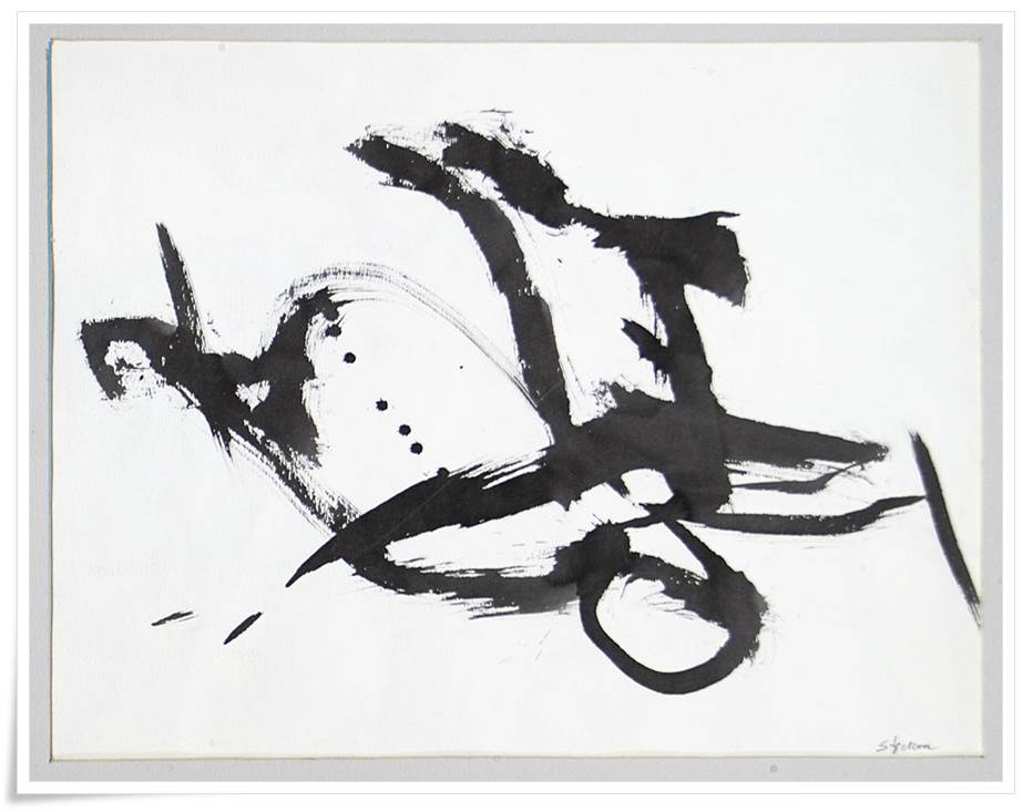
For more on this, see ‘Japanese Art Since 1945, Scream Against The Sky’ (1994) by Alexandra Monroe. In it is reproduced a lithograph by Hasegawa for which I acted as printer/lithographer:
One to Ten – Among Many Things to be Thankful For
What follows is the story of how I came to be the printer/lithographer and facilitator for the making of One to Ten – Among Many Things to be Thankful For.
The Sunday turned out to be a bit bleak. We packed lunches anyway and drove across the bay to pick up Saburo, then across the Golden Gate Bridge and on up the coast to Jenner where the Russian River finds the Pacific Ocean. Our objective was the north beach, always a wonderland of bleached driftwood trees. To my initial chagrin we found a wasteland of charred wood, the remnants of a substantial fire in our former tree, sand and water retreat. It was windy and cold with a still leaden sky. Sand was drifting – and making our sandwiches live up to their name. We chose to stay for some time, walking about, looking and, I, at least, lamenting the loss of the ghostly, sculptural, pristine, polished, bleached wood that had always been there and that we had driven for hours to show my teacher.
Earlier, when I went to his room to pick him up, Saburo asked me in and invited me to sit down. There was a paper screen opposite my place on the floor. A large, black and white ink rubbing with the texture of wood grain was the image on the screen, the only art in sight. After looking for several minutes, I asked, “what is it”? Saburo said “nothing”. Gradually I came to understand it to be Mu, the Japanese (and Chinese) character that signifies ‘nothingness’ or ‘emptiness’.
Leaving the charcoaled, sand-drifting beach we drove back down the coast, stopping once in a while to watch the surf pound the island rocks below us. A bleak day. Almost empty, almost nothing.
I had promised to print a lithograph for Saburo and had told him – “anytime, the stone is prepared”. I had my own press and several lithographic stones on which the original image is drawn for later transfer to paper. On Monday night, after supper, Saburo appeared at our door and said he wanted to start the print. The stone was large and, like all lithographic stones, had a somewhat irregular edge. This is traditionally ignored, being marked off with a non-printing rectangular border inside the stone’s edge. Saburo , however, started by placing a big sheet of paper over the stone and then rubbed around the edge with crayon, making the first mark that of the irregular edge itself. He then cut ten holes in the paper and taped it to the stone.
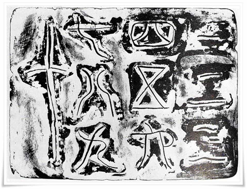
A necessary technical point: a lithographic image is made by drawing with a greasy crayon (or liquid) on virgin, grained limestone. The part touched by grease resists water. The untouched stone is physically and chemically treated with gum arabic, basically to resist oil and accept water on the open parts and to accept oil-based ink and reject water on the marked parts.
In the cut out spaces, Saburo wrote the numbers one to ten in Japanese characters, using a rectangular litho crayon instead of a brush. He then protected them (and some surrounding white space) with strips of cellophane tape. Some parts of the stone were still open – not covered by paper mask or tape. In these areas he stenciled greasy liquid tusche through our landlady’s liberated lace curtain which he found in the basement where I kept my press. The “controlled accident” of this process left charred-looking blotches of textured black and white.
On the second day the paper mask came off and the stone’s edge was already touched with grease, making the outline image of the stone itself susceptible to printer’s ink. It would print, revealing the stone’s natural and irregular shape. In the newly opened space between the cutout and numbers/ shapes, Saburo gently drifted hard crayon across the finely ground, textured stone surface.
The print which resulted, “Numbers One to Ten,” is expressive of the wind, sand, charred wood Sunday picnic. Trees became the numerals – well, one can see it.
The artist was Saburo Hasagawa (長谷川三郎), or Hasegawa Saburo in Japanese convention, possibly the first modern abstract artist in Japan. A world-traveled, world-class teacher, scholar and artist, he lived, studied, worked and taught in the United States and Europe as well as in Japan. He wanted to understand everything and to provoke consequences for the future art of both the East and West. It was 1955; he was my graduate teacher. In 1957 he died. He is still my teacher, although I am now considerably older than he was then.
This short note was prompted by discovering the “Numbers One To Ten” print reproduced in “Scream Against the Sky – Japanese Art After 1945 ”, by Alexandra Munroe, Harry Abrams publisher, 1994.
A final note on the making of the print: After pulling the first proof the stone was closed. I opened it two days later, re-inked it and pulled a second proof which had darkened, losing some of the silvery delicacy of the first proof which, of course, Saburo had seen. I took the new, darkened but richer version for him to see, full of foreboding that I had ruined it. He listened to my tale of woe about what had happened and then took a rather long time to study the new version. Finally he said, “It is better. Print the edition.” – which I did. In the reproduction in Munroe’s book, the full image is given, including the irregular stone’s edge. (I have seen it elsewhere, in his own, posthumous history published in 1977, with that edge cropped off – an unfortunate publisher’s error..…)
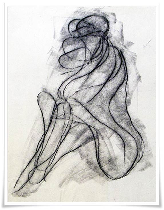
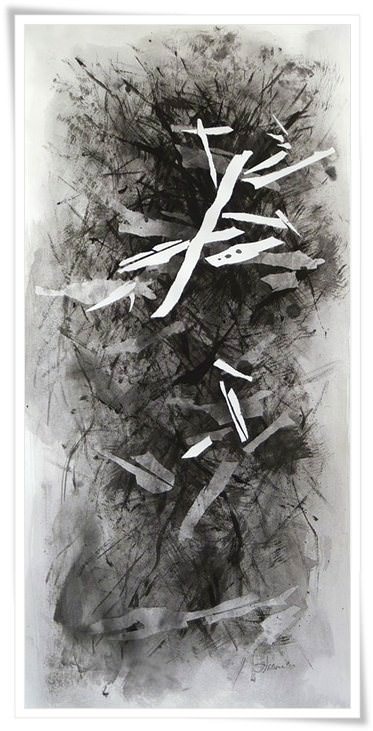
An image of my work pictured below is a brush-written ‘abstract calligraphy’, in this case, abstracted from a piece of farm machinery, a thresher, written instead of rendered or photographically represented.
And, for now, I leave you with that.
Mel Strawn, February 2013,
Mel Strawn, Professor Emeritus, was Rona Conti’s first art teacher at Antioch College in Yellow Springs in the 1960’s. A role model from then to the present, he is both superior teacher and artist. His curious and adventurous mind meshes intellect with delving deeply into the experiential. His work and thoughts can be found at here.