It is true that calligraphy is created in seconds, by means of single unrepeatable brush strokes, but it doesn’t mean that there are no rules governing it, quite the contrary. The Chinese word for East Asian calligraphy is shufa (書法, pinyin: shū fǎ, i.e. “the principles of writing”), and there is a good reason for this. Calligraphy without rules would be like a beautiful mind without direction. Some calligraphy rules are over 2000 years old, and they are still respected and followed. The art of seal pressing is a vital part of both calligraphy and ink-painting. Without knowledge of how and what kind of seal to press, one can never be called an accomplished calligrapher.
First, a work without a seal is worthless, or of decreased value. We need to bear in mind that calligraphy works were copied for millennia, whether via studies of rinsho (臨書, りんしょ, i.e. “copying [studying] masterpieces”) or a commission from an emperor. A brilliant eccentric Song Dynasty (宋朝; pinyin: Sòng Cháo, 960 – 1279) calligrapher and ink painter (墨絵, すみえ< sumi-e) Mi Fu (米黻, pinyin: Mǐ Fú, 1051–1107 C.E.), also known as Mi Fei (米芾, pinyin: Mǐ Fèi), mastered the art of copying classics to such a degree that he was able to fool the imperial court specialists. For his own amusement, he showed them his own work without any signature or seals, to see how they would respond to them and their authenticity.
Calligraphy itself, as well as a signature, can be copied virtually indistinguishably. Seals, on the other hand, cannot (this is if we exclude today’s laser technology). The final judgment in regard to the authenticity of a calligraphy work is always based upon the seals.
There are various types of seals. In fact there is an article about this on our www.shodopedia.com page, however, I will repeat it here for easier reference.
- There are four main categories of seals that determine the placement on a work of calligraphy. They are:
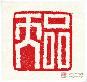
- Seimei-in (姓名印, せいめい いん, i.e. “real name seal”); Figure 1.
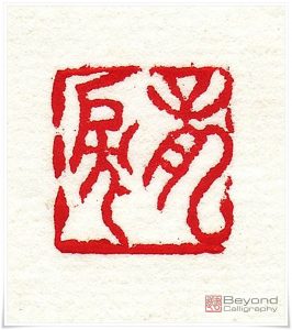
- Gagou-in (雅号印, がごう いん, gagō-in, i.e. “pen name seal”); Figure 2.
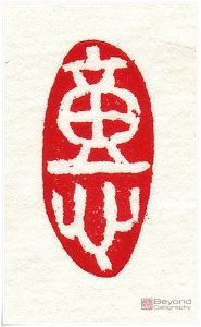
- Inshu-in (引首印, いんしゅ いん, “quote top seal”); Figure 3.
- Oukyaku-in (押脚印, おうきゃく いん, ōkyaku in, i.e. “footer seal”); Figure 4.
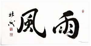
Both “real name” and “pen name” seals are to be pressed under or on the left hand side of the signature (Figure 6). The traditional direction of writing calligraphy is from top to bottom and right to left. Naturally, the signature seal comes after the signature executed with a brush, which is why both seals are to be pressed after the signature.
Seimei-in comes first, and its characters are carved in intaglio (白文, はくぶん, hakubun, lit. “white text [on a red background]”, as after pressing the text remains white). Gagou-in is (usually, but not always) carved in relief (朱文, しゅぶん, shubun, lit. “red text [on a white background]”) and it is to be placed below the seimei-in.
It is possible to press only a pen name seal, however, as mentioned above, a calligraphy work without either of them (real name or pen name seal) has little to no value. A pen name normally consists of two characters. Using my own name as an example, it is 龍涙 (りゅうるい, ryūrui, lit. “Tears of Dragon”; in short, the Dragon is the upright mind with which I write, and Tears are the emotions poured onto paper, i.e. the ink of the soul). Usually, the pen name is carved on one seal, in which case it should be in relief. However, on seals as small as 5 x 5 mm, the seal carver may split both characters and carve them onto separate seals. In that case, the top one (龍) will be carved in intaglio, and the bottom one (涙) in relief. In case the pen name seals are split onto two separate stones, they are usually, but not necessarily, pressed without the signature.
Calligraphy, being an ancient East Asian art, is sewn with myths and symbolism. Intaglio and relief represent opposing elements. The forces of Yin (陰, pinyin: yīn, i.e. “the shadow”; female element) rule the seals in intaglio, whereas the forces of Yang (陽, pinyin: yáng, i.e. “the sun”; male element) rule the relief. This is why pressing two seals in relief or intaglio after the signature will ruin the balance and disturb the energy flow, so called (行気, ぎょうき, gyōki, i.e. “moving spirit”).
In case two seals (one in intaglio and the other in relief) are pressed near the signature, the type of the inshu-in seal can be decided by the calligrapher, unless, it will be followed by the footer seal (though this is not always respected).
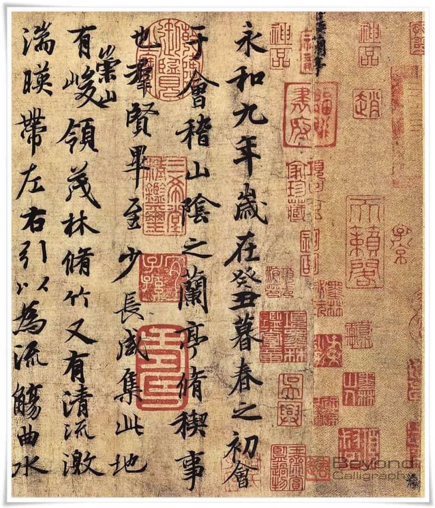
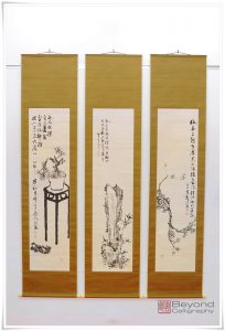
Some works, especially ancient masterpieces, can have as many as 60 seals or even more (Figure 7). Those are not pressed by the author, but either by collectors, owners, even emperors, or famous calligraphers who simply had the opportunity to read them. Such seals not only re-confirm the authenticity of a given masterpiece (though not always, as the originality of many famous works is being disputed by modern scientists; the autobiography by Huai Su (懷素, pinyin: Huái Sù, 737–799 C.E.) could serve as one example), but they also increase its value.
The third seal category is inshu-in. Originally this seal was meant to disclose the location of an artist or suggest the place where the given calligraphy was written. Today, calligraphers press such seals with their favourite phrase, idiom, personal poem or reflection. The seal is also known as 詩句印 (しく いん, shiku in, i.e. “verse seal”). Shiku-in is also sometimes pressed at the bottom of the page as a “footer seal” (Figure 4). All of these types of seals are generally referred to as leisure or mood seals. Professional calligraphers can own up to a few hundred such seals. My inshu-in in Figure 1 reads: 童心 (どうしん, dōshin, i.e. “child’s [pure] mind”).
Figure 5. The basic rules of seal pressing can be seen in this embedded movie.
There are other types of seals, such as 干支印 (かんしいん, kanshi-in, i.e. “sexagenarian cycle seal”). They bear one of 60 characters symbolising a year in Chinese astrology, reminding us of strong ancient connections between the supernatural and the calligraphy. If you look at the History of Chinese Calligraphy on our main page here, there is more information on the occult and calligraphy.
Seal pressing takes time. It is better to think and place your seals well than to destroy the harmony of the work. I have created a 9 minute movie, which is embedded in this article, where I show how to prepare the ink mud (印泥, いんでい, indei), the paper, and the seals for pressing. Please watch it if you like. As the saying goes: “A picture is worth a thousand words” (see Figure 5).
Calligraphy is black and white, but the seal imprint is red (or orange-red). Why is that the case? Simply, the seal adds the final touch to the work. It imbues the monochromatic world with its vigour and breaks the symmetry of the mood. Although a subject for a separate article, the ink mud used for seal pressing comes in various shades, and the most beautiful one is defined as 美麗 (びれい, birei, i.e. “gorgeous”).
