What is the meaning of the color red in various cultures? What comes to your mind first? Red as celebratory in China, red for a 60th birthday in Japan and your second childhood, a red light meaning stop immediately or the dreaded X in red in Western cultures meaning incorrect on schoolwork?
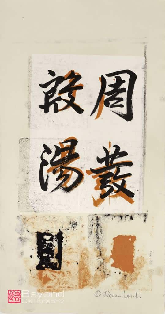
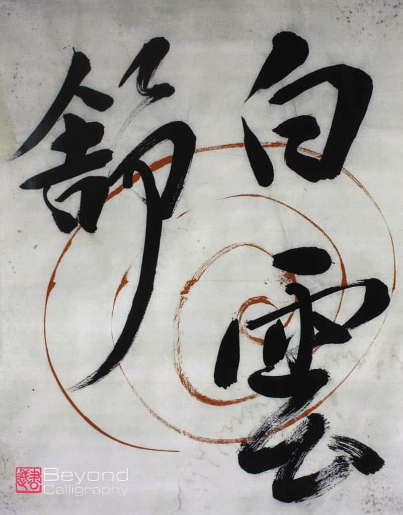
You must be thinking, now what does all this have to do with Japanese calligraphy? In my view, a great deal. It turns out that teacher corrections to calligraphy are made using red ink though in truth the color is not a deep primary red but rather leaning toward red-orange. Japanese calligraphy teachers also may make samples for their students to copy using this same ink. Thus, this color denotes teaching materials and corrections presumably done by a fully licensed Sensei, teacher or Calligraphy Master.. The main and most important difference in this case versus the dreaded red X is that the teacher both corrects mistakes and tells the student that they have done something well using circles or parts of circles. Often the corrections are brushed directly on top of the student’s work or alongside them.
Every teacher will correct according to his or her own style, but all will take into account some major overall concepts which must be executed. First and foremost is placement, the division of space. With only black ink on white paper, every stroke is seen. With a developed and practiced eye, one can even see the order in which the strokes were laid down. One never makes corrections or fills in or changes what one has written. If the results are not satisfactory to the calligrapher, they will discard the attempt. It is only when a work is sealed by the artist that the approval of the artist calligrapher is certain. There is no going back.
But it is not only each character which must be executed according to strict rules, placement overall is critical. If the placement is not balanced or goes too near the edge, for example, even in one character, the overall piece is flawed. As an abstract artist learning calligraphy for the first time at almost age 60, placement, balance of elements is something I had been refining through my abstract painting. But I knew nothing about Japanese calligraphy except that I was enormously drawn to it and inspired by it. I only became aware of grids when I noticed some students of Sensei using them. But I had already been studying with her for three months, and she had not given me grids as part of my basic materials. I asked her if I should have one, she replied “You do not need it.”
That did not mean that I correctly balanced what was being brushed, not at all. Rather she observed that my approach to the calligraphy was to “eyeball” where things should be, trying to account for the overall and not run out of room. If something was not placed correctly, she would write over the characters with her red ink or sometimes put an arrow to indicate a change in placement.
Often, after I have written something, I can see that there are imbalances and my placement of characters is, in places, helter-skelter. Of course, in calligraphy, one never retraces any steps but rather tries to do better in the next piece. Thus, to achieve balance, placement has to become so often practiced that it becomes instinctual. Again, this is a very difficult concept to explain so corrections from Sensei visually demonstrate the mistakes or suggestions of how to improve with that beautifully colored ink. In person is, of course, the best way to continue to learn, but correspondence is second best and can work as well.
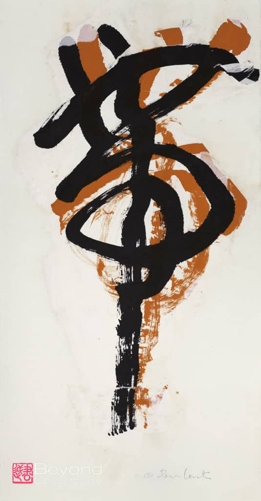
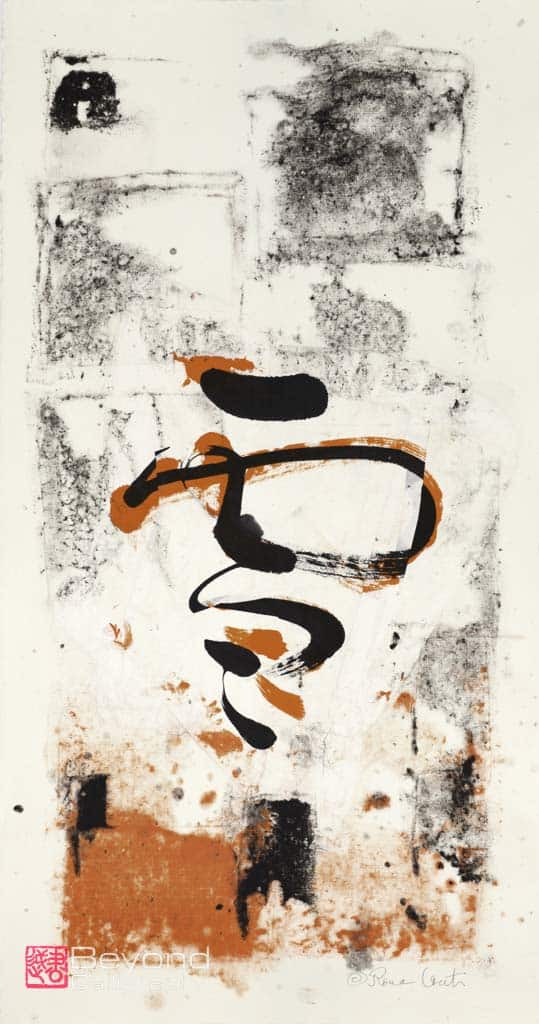
My series of artworks called Collaborations began, though unbeknownst to me at the time, the very first time I saw Sensei’s corrections and the overlaying of her ink on my calligraphy practice. I was entranced. It seemed incredibly beautiful. The word “mistake” did not enter my mind, I was simply enjoying the beauty of the two toned calligraphy, then planning to look carefully to see what mistakes I had made.
I then learned the “shorthand” for “non-mistakes”. While I do not know if this is always used, I have seen many teachers employing circles as a way to point to what is well done. Sometimes there will be a small circle on only one part of a stroke and at the opposite end of the spectrum will be four or five circles covering the whole piece.
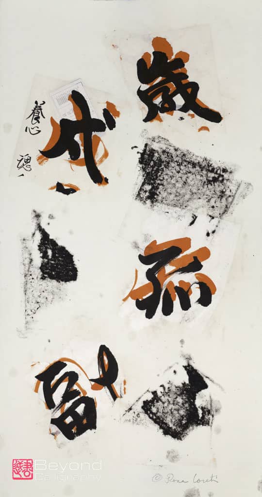
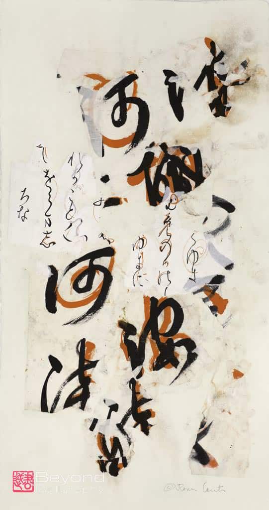
Once I had accumulated many pieces of practice work with Sensei’s red-orange ink, it occurred to me that I should celebrate this beauty rather than looking at the overlaying as a mistake. But at the time I was back in the States and doing my work by mail. I decided that I would experiment and see what artwork in handmade paper might be possible using fragments. Then, if successful, I would take them with me on my next trip to Japan and ask Sensei whether or not she would agree to my using fragments to produce, in pulp painting, finished works of art. They would be collaborations because the red-orange writing is, after all, hers.
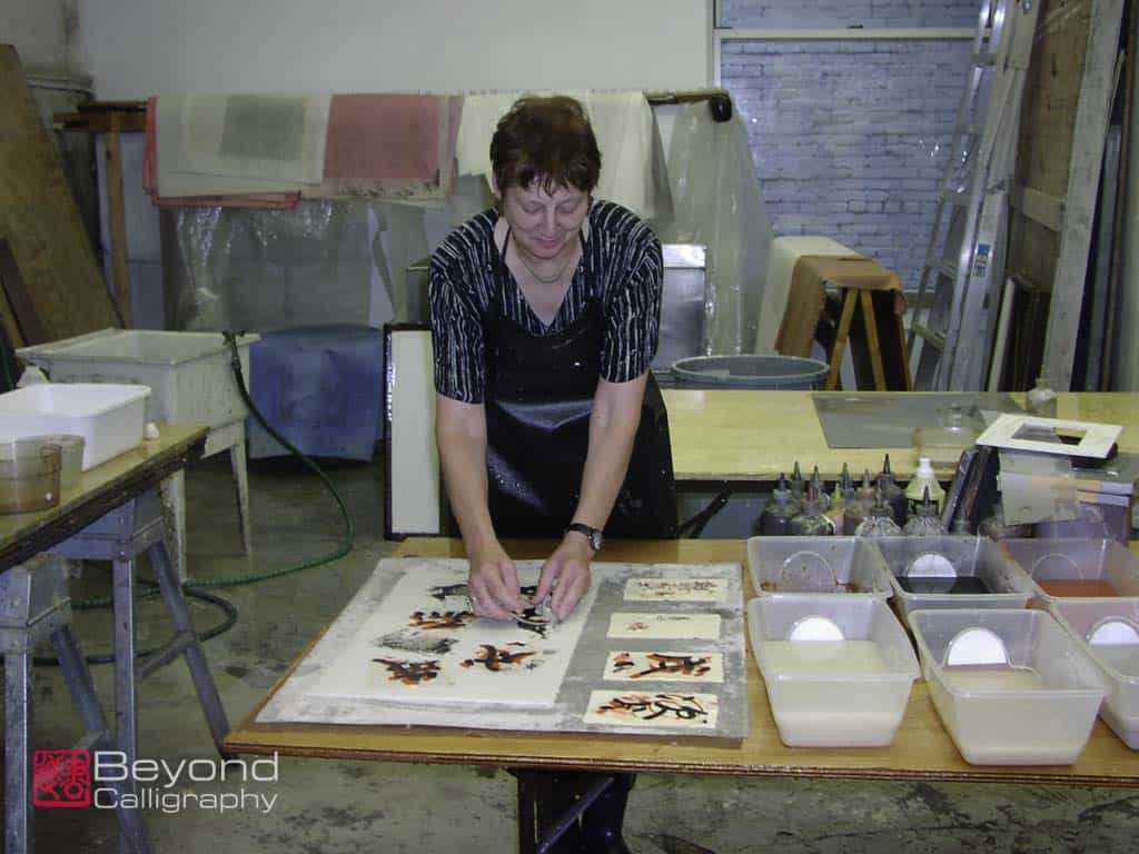
I had gone many times to Dieu Donne in New York City to do handmade paper artwork, so once again I contacted them and made a date to produce work. .
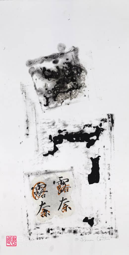
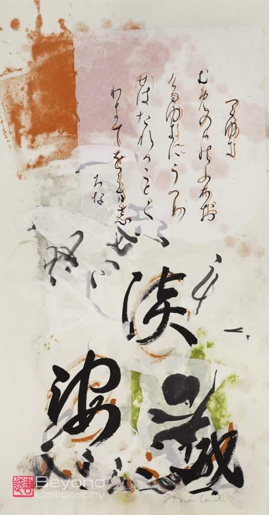
Much experimentation was needed to come up with a way to make sure the fragments would adhere to the base sheet. It was the first time I had tried to invent a new way of multiple layers in paper. In the studio, I thought that I had seemingly figured out how to adhere the fragments. But it was not until after all had dried that I could be certain. I chose those to which I gave my personal approval, meaning signing my name and sometimes using a seal, authenticating the artwork. I then took examples on my next three month stay in Japan studying with Sensei. I did not show them to her right away but rather got back into calligraphy rhythm in her studio, then brought them to her to see her response. She was quite surprised and said she had never seen anything like what I had done and was happy to have me exhibit the pieces as collaborations.
Interestingly, when I showed these works to other Japanese, I was asked me why I would willingly show “mistakes”. They could not overcome the perception that what they saw with the red-orange ink symbolized failure. Yet what I had done was to take what was present, to tear the paper into fragments, collage them into a balanced artwork, adhere them to handmade paper sheets and let them dry slowly. For those who could not or cannot understand my fascination with the resulting calligraphy and corrections, I can only say that in looking at artwork, often one has to let go of preconceived notions of what is correct. What I had done in finding the beauty within may seem counter to commonly held assumptions about mistakes. I was trying to reinvent or change mistakes into another form.
The resulting series was viewed by Catherine Mayes, then Curator at the Duxbury Art Museum in Duxbury, Massachusetts. While there were other series from which she could have chosen, at the studio she selected 8 pieces from what I call Magical Mistakes and Calligraphy Collaborations for an exhibition two years hence. From supposed mistakes to making artwork was a great pleasure, particularly because my Sensei found them to be highly unusual and interesting. I hope that you too will find inspiration and be interested in seeing them.
Anyone wishing more information is welcome to comment.