All artists need to become skilled in accepting the many ways of rejection, from form letters to “we had so many high quality applicants, unfortunately you were not selected etc.” Some offer encouragement which is appreciated. Whatever the reason for not being accepted into an exhibition or a gallery or when there is a likely sale that doesn’t pan out, we should expect that to be the norm but never stop trying to reach as high as possible.
Handpapermaking.org is a non-profit organization dedicated to advancing traditional and contemporary ideas in the art of hand papermaking. With a biannual magazine, newsletters, a searchable database and much more. A feature of the organization is producing biannually a distinctive series of limited edition themed portfolios which are sold at a reasonable cost to support the non-profit.
When I read about submissions to a special portfolio edition titled “Calligraphy and Handmade Paper”, I knew I wanted to apply. I had missed the previous edition titled Pulp Painting because I was, at the time, living in Japan. That would have been a perfect match. But I was pleased that I would have another chance and made my application. I had never made an edition before, did not have my own papermaking studio but had worked several times at Dieu Donne in New York City.

Dieu Donné is the world’s leading cultural institution dedicated to serving established and emerging artists through the collaborative creation of contemporary art using the process of hand papermaking. Founders Sue Gosin and Bruce Weinberg opened Dieu Donné in 1976, one of the very few pioneer papermills in New York City and the U.S. Thirty five years later, Dieu Donné is among the hundreds of hand papermills and print shops across the country dedicated to the creation of handmade paper.
After applying, I received a large commission to which I committed my future months. If I were indeed chosen, the two would overlap which could be a problem. It is probably the first time I thought it would be just as well to be rejected. However, the response to my application was affirmative. I was expected to do an edition, write about my work and process and have all finished and delivered in a few months.
Challenges abounded, and I welcomed them. First I had to figure out what image I might use and then how to make 150 of them. Most editions are the same image. Mine would have to be close, the same image/character, but each one would be unique since the process would be sumi ink on paper and not a “printed” image.
The letter included information that the participating artists, both juried and invited, were Timothy Barrett & Thomas Ingmire; Neal Bonham & Suzanne Moore; Annie Cicale & Claudia K. Lee; Rona Conti; Nancy Culmone & Tom Leech; Tatiana Ginsberg & Shibata Reiho; Karen Gorst & Mina Takahashi; Katie MacGregor & Nancy Leavitt; Miriam Londoño; Pamela Paulsrud & Andrea Peterson; Gretchen Schermerhorn & Marina Soria; Susan Skarsgard, Wesley Tanner & Kathryn Clark; Cynthia Thompson & David Charles Chioffi; Jessica White & Cheryl Jacobsen; Ann Alaia Woods. I was delighted to be in such fine company.
A custom-made clamshell box was to house the artworks, each in a protective folder imprinted with the artists’ names. A hand bound booklet containing statements from each artist and a commissioned essay by Rose Folsom, editor of Letter Arts Review and a widely exhibited calligraphic artist, would be inside.
Thus I began. I sketched and tried out and thought of many characters and poems to write in Japanese including one of my favorites by Chio Jo (sometimes called Chiyo-ni). She is considered to be the female counterpart to Basho, Japan’s most well known male haiku poet. She was born in 1703 in Matto, a small town but near Kanagawa. Her family had a scroll mounting business. Thus she was surrounded by calligraphy and poetry and painting at a very early age. I re-read the excellent book called Chiyo-ni, Woman Haiku Master by Patricia Donegan and Yoshi Ishibashi. There were many favorite haiku, but the one I love the most is below.
Airing out kimonos
As well as her heart
Is never enough
This haiku has been interpreted as a feminist one referring to the summer process of caring for kimonos and the general burdens on women in the 18th century. My original plan was to write this haiku in kana or women’s writing, soft and flowing ,and then choose one large character expanded from the poem. I then decided the character I wished to depict was “Obi”, the wide sash worn with formal kimono. As I made sketches, I concluded that the large Obi calligraphy and a haiku was too much for the smallish format required so I eliminated, with great regret, the haiku.

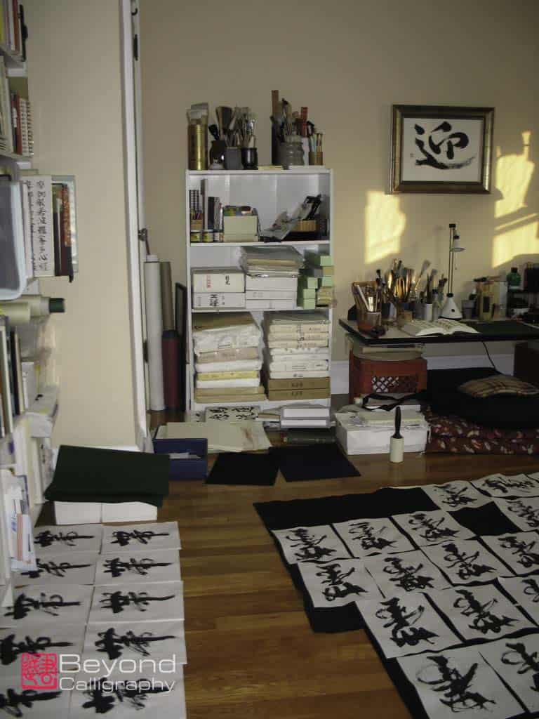
I then had to come up with a step by step way to make an edition. After experimenting with various papers, I decided upon one, cut many to size and chose as my brush one I had made of deer tail many years ago. That would ensure a more spontaneous stroke result rather than a mechanical one. (Fig 1,Fig 2) I proceeded over many days to do about 220 “Obi” from which to select the best. Rather than being arduous, it was actually quite meditative and surprising as various Obi took shape upon the paper.
I had to use the same ink for all, and it had to be ground by hand to be certain that when it came into contact with water to mount it, it would not bleed and would be permanent. I used a very high quality ink stick I had purchased in Nara, Japan at the storied ink-makers Kobaien. The ink has a slight tone of grey. Many people think of ink sticks as “black”, and that is true as a generalization. But every ink has different qualities and tones.
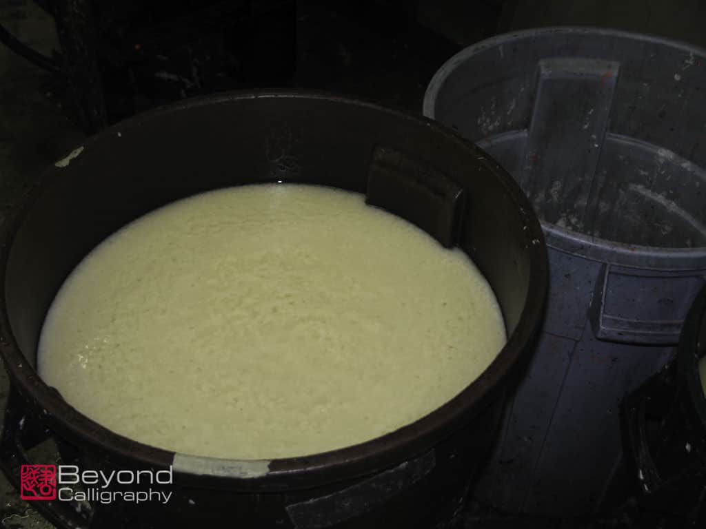
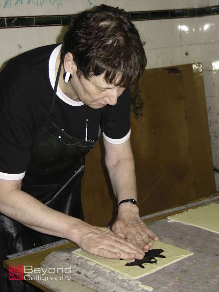
I booked my days at Dieu Donne and took my many sheets of Obi and other tools with me to New York after deciding upon the color of the pulp which would be prepared for me in advance along with everything else to make the process smooth. The beauty of working at Dieu Donne is that indeed all is prepared for you so that you can be the artist and create. Assistants and staff are incredibly skilled in creating solutions to problems which may appear in the process. But before proceeding, consultation is required so multiple decisions are made in order to have the right materials ready for the artist. I chose the thickness and the creamy color of the sheet based upon previous experiments at Dieu Donne. (Fig. 4)
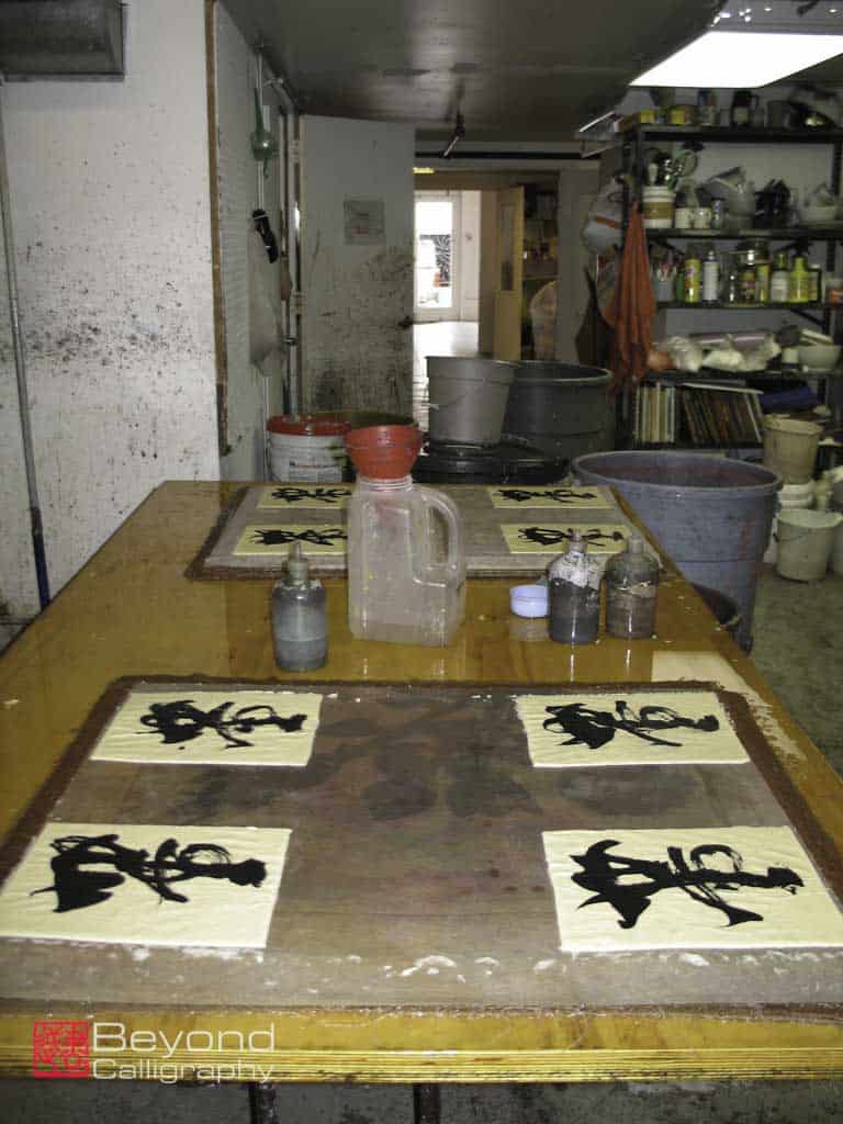
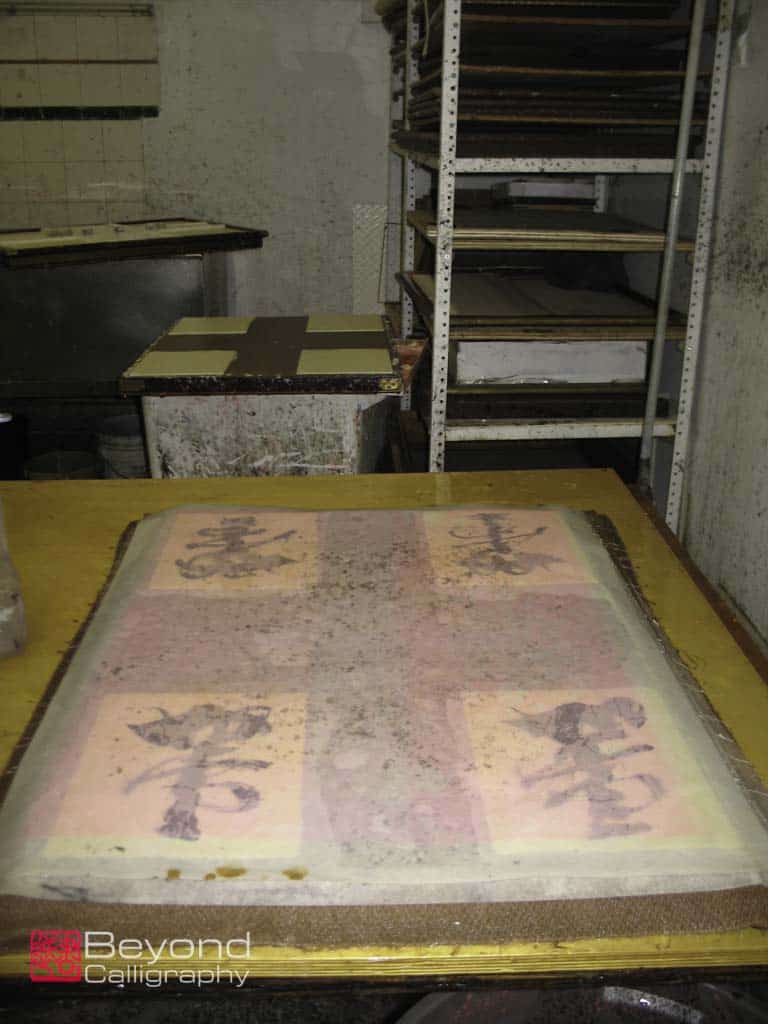
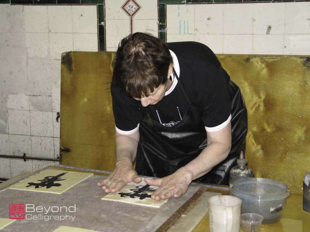
The photographs included show the base sheet of pigmented pulp of cotton linters formed on a Western mould outfitted with a shaped deckle to produce four sheets at a time. (Fig 3) These were then laid onto a support board with felt pads underneath and placed on tables for working. In order to be certain that the calligraphy would bond fully to the cotton base coat, I sprayed a light coating of methyl cellulose onto each base sheet first, then proceeded one by one to carefully lay the artwork onto the base. (Fig 5, 6, 7) Since all is handmade, there were some adjustments to be made with the pulp, but I wanted the final edition pieces to have the deckled edge I love, whether it be in books or artwork.

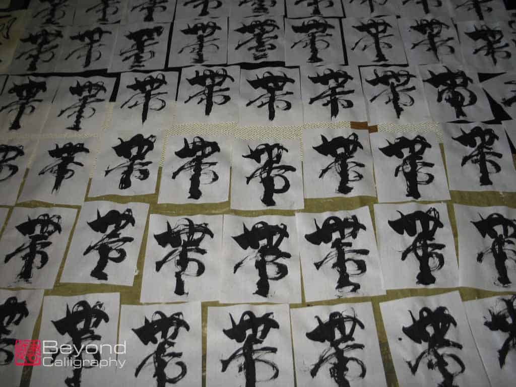
The image of the Obi occupied the whole space, with an intended seal to be placed as the final step. An Obi is a long rectangular piece of fabric requiring skill and knowledge to wrap it properly around a kimono, a very complex series of folding. The whole outfit and underpinnings required for a formal kimono staggered my imagination when I first was fitted for one. Yet, beautifully done, it should look effortlessly achieved. When I looked up the character for “Obi”, I was delighted with its shape which I feel duplicates that of a kimono laid out flat.
Finishing the many images, each unique but all recognizable as the same character, my work to that point was over. (Fig 8) But once the artist has completed his or her work, the process itself is far from over. Dieu Donne presses the excess water from the artwork with a 2 ton press which is protected by heavy wood boards, then felt sheets, then cotton sheets. (Fig 9) The large space and equipment required to slowly dry the artwork over a period of a week or longer, changing the absorbing pads frequently, is all part of the process handled by Dieu Donne. Once fully dry, the work is given or mailed to the artist.
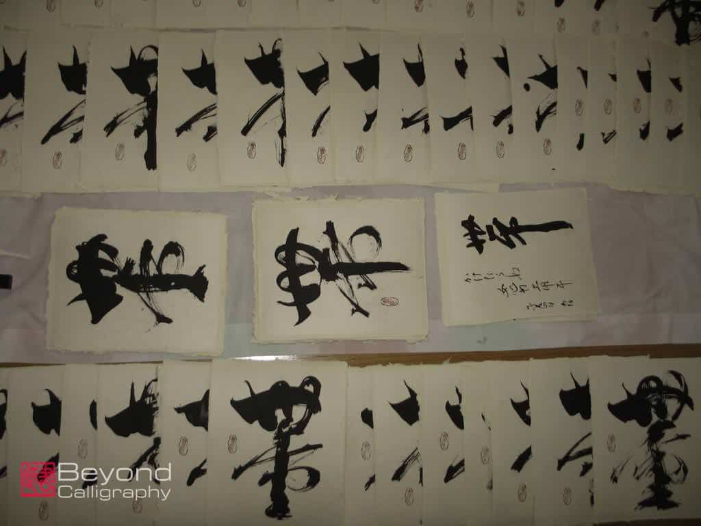
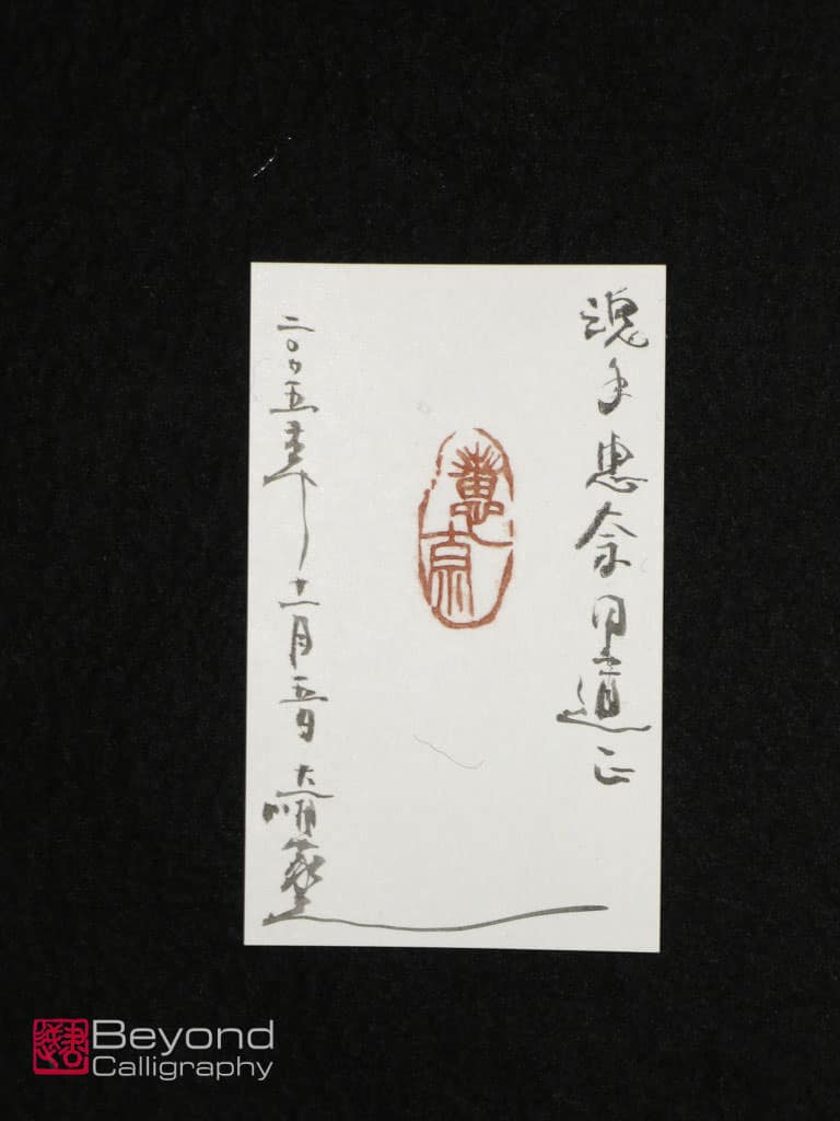
Once I received the work, I again edited and chose the pieces to be sealed. Choosing the seal was, of course, also part of the artistic decisions. The one I chose was made for me in Japan, the sample card shows the name of the sealmaker on the left and the date and on the right is my Kanji name Konte Lona. (Fig. 10) At the time, the seal paste I had all had variations of orangey-red, and I was dissatisfied with the way that color looked on the edition. Thus began another search. I am often frustrated that almost all of my calligraphy equipment must be purchased in Japan where it is so easy to find what one needs. Fortunately I found a Chinese calligrapher from whom to borrow some seal paste in red. When I did go to China a year later, I made certain to stock up on similar paste. All of these decisions make up the final artwork which should look confident and as if it painted itself.
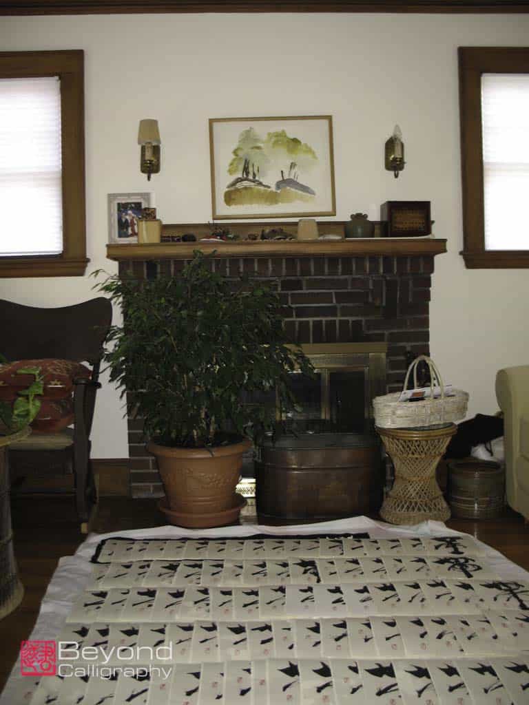
Sealing the work was a chore because the paper was thicker than that intended for sealing, my arms and hands were sore by the end. However, it was fun to line them up to dry in my living room. (Fig. 11,12,13) Once dry and signed and numbered on the back, I shipped them to Handpapermaking “giri giri” (means last minute or down to the wire).
The final result with the work of all of the artists is, in my view, quite a stunning array of interpretations. Each image can be framed and stand by itself or the group can be framed as a whole. Handpaper making often has traveling exhibitions of their portfolios. Happily others have agreed about the uniqueness of the portfolio titled Handmade Paper and Calligraphy and have purchased one, including the Metropolitan Museum of Art in New York City.