Before even considering writing kanji (漢字, かんじ, “Characters of Han (dynasty) China” i.e. Chinese characters), regardless whether we choose a pencil or a brush, one needs to comprehend the correct stroke order for individual characters. Not many people (outside the Far East) would give it a thought, but the stroke order (i.e. the order in which you write the lines of each kanji) is more important than it may seem. From the calligraphic point of view it affects not only the characters’ balance and their general appearance, but also how powerful the message they conveys really is. From a linguistic point of view, it affects characters’ readability. Finally, from the practical point of view, the knowledge of the correct stroke order assists in studying the characters.
First of all, let us discuss the stroke order rules governing writing Chinese characters. Generally, the priority of writing is as follows:
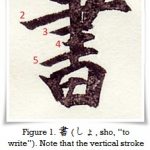
- From top to bottom (Figure 1)
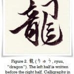
- From left to right (Figure 2)
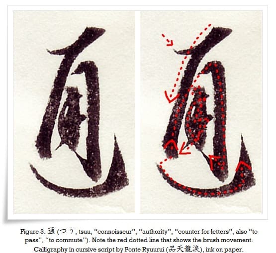
- From outside to inside (Figure 3)
Let us closely examine the character 通 (つう, tsū, “connoisseur”, “authority”, “counter for letters”, also “to pass”, “to commute”). I purposely chose a cursive form of the character with the intent of utilizing it as an example of a character corresponding with more than one of the stroke order rules. As shown in Figure 3, we start to write from the top-left corner and proceed to the bottom-left corner (top to bottom), and then to the top-right corner (left to right), etc. This one stroke in Cursive form encompasses three strokes in standard form. The second stroke completes the partial enclosure and then the middle part is written. Lastly, in one stroke, the “movement” radical is completed (the dotted red lines on the right-hand-side character show the brush movement). “Movement” radical is the “L” shaped semi-enclosure on the left-hand side of the character 通.
The above three general rules do not exhaust the stroke order rules of Chinese characters. More detailed stroke order rules are as follows:
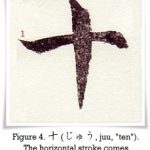
- Horizontal before vertical (Figure 4).
- Vertical lines that cross many horizontal lines come last (Figure 1)
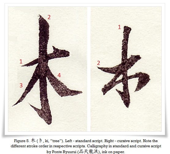
- Left slanting strokes before right ones (Figure 5)
- Centre line before left- and right-hand strokes in vertically symmetrical characters, in which the centre line is the axis (Figure 6)
- Enclosure before the inner strokes (Figure 3)
- Left vertical before partial enclosing (Figure 3)
- Bottom enclosure last (Figure 3)
- Dots last (example: 玉 (たま, tama, i.e. “sphere”)
Of course, there are exceptions, as with every rule. They usually concern more complex or non-symmetrical characters. Also, it is important to realise that the stroke order depends on the script we write in ; there are five major calligraphy Styles, i.e. seal script (篆書, てんしょ, tensho), clerical script (隷書, れいしょ, reisho), cursive script (草書, そうしょ, sōsho), standard script (楷書, かいしょ, kaisho), and semi-cursive script (行書, ぎょうしょ, gyōsho). Note the different stroke order for the character 木 (き, ki, “tree”) in the standard script (left hand side character of the Figure 5), and cursive script (right hand side character of the Figure 5). In standard script, the horizontal stroke is written first, then the vertical one, and finally left and right slanting strokes. As you can see, the cursive form begins with the vertical stroke and the remaining three strokes are executed in one continuous stroke. I have added numbers in red to clarify this.
Now, let us go back to the first paragraph of this article and look closer at the three categories mentioned there.
Stroke order from calligraphic point of view.
The beauty of calligraphy is closely related to the energy flow within the black lines. In Japanese it is known as gyouki (行気, ぎょうき, gyōki, i.e. “moving spirit”). Gyōki is a free and unrestrained energy flow from one stroke to another, both within the character and then throughout the whole composition, including the calligrapher’s signature (落款, らっかん, rakkan) and his seal(s) (判子, はんこ, hanko). Similarly to a fresh spring originating in the high mountain peaks, the water-like spirit glides through the black ink strokes, bewitching our soul with harmony and balance, stimulating with power and vigour, or intriguing with imaginative forms, and stunning yet intuitive curves.
If the stroke order is incorrect, then the brush soaring from a starting point (起筆, きひつ, kihitsu, “awaking of the brush”, i.e. the place where the brush comes to a contact with paper for the first time ) to the place where a calligrapher stops writing (終筆, しゅうひつ, shūhitsu , “end of brush stroke”, i.e. a place where the stroke ends and the brush is lifted from the paper surface), instead of creating a work of art, will spawn a maze of lines spouting dissonance instead of harmony.
While writing, the calligrapher lands the brush and then lifts if off of the paper’ssurface many times, yet his hand leads the brush from 終筆 to 起筆 by “writing” a connecting line in the air, in a smooth gesture. This is what we call renmentai (連綿体, れんめんたい, i.e. “unbroken line”). Renmentai can be implicit or explicit. The unbroken line that you see on the paper (one or more strokes, or even characters, written without lifting the brush from a paper surface) would be an explicit renmentai. The line that we cannot see but we can only imagine it by following the brush strokes sequence on paper would be the implicit renmentai. Figure 7, which is a 臨書 (りんしょ, rinsho, lit. “facing (someone else’s) writing”, i.e. free-hand copying of masterpieces for studying purposes) of fragment of a letter by 王羲之 (Wáng Xīzhī, 303-361) is a perfect example of both implicit and explicit renmentai. The red dotted lines and numbers from 1-4 show the movement of the brush in the air. Following with your eyes from 終筆 to 起筆 you will notice that there is an implicit continuity between the characters. The blue arrows (marked “1” and “2”) show the explicit renmentai of two characters that form the word “teacher” (先生, せんせい, sensei). Harmonious renmentai is unachievable without maintaining proper stroke order. Combined with skills and passion of the calligrapher, the correct stroke order awakens the life and energy quietly slumbering in the supple ink.
Readability and the stroke order
Characters written in standard script without maintaining the proper stroke order will still be mostly readable, though badly disfigured. However, when we move to semi-cursive or cursive scripts, this issue becomes serious for the decipherability of the characters. Cursive script is by far the most intuitive and complex script in Far Eastern calligraphy. To be able to write it and read it one needs to study it carefully. Note the one stroke 耳 (みみ, mimi, “ear”) executed in Cursive script (Figure 8). One needs to study the Standard script, then Semi-cursive script to be able to comprehend its shape.
The general rule of the cursive script is to simplify the left hand part of the character and amplify the right hand part of the character. For instance, the radical 言 (げん, gen, “word”, “remark”) and 水偏 (さんずい、sanzui, i.e. water radical (it looks like three dots on the left hand side of a character, which symbolises its connection with liquid, just like in this character: 江, which means “inlet “, ” bay”)can be written in the same manner, as shown in Figure 9. This, however, does not mean that the right hand side of a character written in cursive script is any easier to read than the left hand side! The situation becomes even more complex when the characters have non-vertical symmetry, but that is a subject for a separate article.
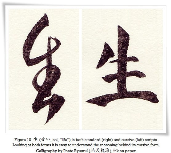
Now, in cursive script, writing without knowledge of the proper stroke order will create unreadable characters. The meaning of a cursive script character is more a matter of intuition than reading (as is the case when writing it), and since incorrect stroke order distorts the gyouki, the text becomes impossible to decipher. Note the logic and at the same time, the grace of the cursive script of the character 生 (せい, sei, “life”). I wrote both, standard and cursive forms, for comparison.
On top of that, the rules of the stroke order in each script, but especially the standard, semi-cursive and cursive scripts may differ greatly. Without knowledge of these, it is rather troublesome to write or read (Figure 5). Clerical script as more relaxed stroke order, though it tends to follow the three general rules (top to bottom, left to write, and from outside to inside). Clerical script was the first scripts that showed some regularity in stroke order.
Learning kanji and the stroke order.
Nearly any dictionary that you can buy offers multiple character classifications. Some of them are based on stroke count or character composition and construction (vertical, horizontal, enclosure, top to bottom, etc).At the very least, knowing the correct stroke order will help you in finding a character as yet unknown to you. Last but not least, the knowledge of stroke order will speed up your studies of the kanji. It is much easier to study something understanding it, rather than trying to mindlessly memorize it. Keeping this in mind, please note that stroke order may vary in Japanese, Chinese and Taiwanese dictionaries, and some characters may have various stroke orders (for example, the character 必 (ひつ, hitsu, “certain”).
Note: The calligraphy written for this post is of a small scale; the original characters do not exceed 2.5cm in height. Images were zoomed while scanned which is why the lines and ink colour may seem distorted. Small scale calligraphy is more convenient for displaying details and for explanatory purposes.

