Usually employed to communicate with others–present or potential, its overt or subjective value is most often utilitarian, a nearly invisible, efficient means to an end, the conveyance of information. Beyond the many such manifestations it partially shapes, informs (literally) and transmits experiential value(s). In practice, in East and West, the forms taken by written/calligraphic language embody much beyond the literal meaning of the word or words. In type, both in the East and West, even those forms derived from hand-written traditions exhibit a mechanical “perfection” that is essentially neutral in what I’ll call expressiveness. They are, in their type-set form, predictable and exact, uniform. As form sets they do, to be sure, evoke certain qualities and associations that impart a certain feeling or association beyond (or underpinning) the literal message content. Subtly, one feels different when reading a text in Times Roman as opposed to, say, Futura or Bodoni–fonts with or without serifs. Still, there is a trade off–relatively anonymous efficiency for infinitely varied, emotionally felt experience that is possible in written letter forms.
I had to draft complete alphabets of all three designed letter forms mentioned above–in my first year of art school some seventy years ago. And, before that, Palmer Method handwriting was normal grammar school discipline. The tools used were hard… ruling pens, straightedges and steel-nib pens. These tools left their signatures…also hard, a bit cold, hopefully precise and following prescribed form. Sign writers (writers!), I observed after a while, used flat bristle brushes. Freehand. Miraculous! I thought.
All this is to highlight the concern I’d like to discuss–that of “information” imparted (or not) by visual art including calligraphy considered as art.
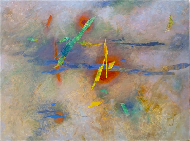
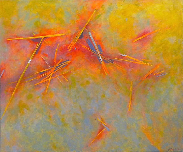
By way of personal context–my own art is predominately abstract or non-objective. It sometimes includes forms that resemble Asian characters. Abstract calligraphy–not so strange, considering that many actual characters owe their current forms to previous abstracting from pictographs. Recently, among a small group of friends, I was asked if my art imparted “information”. I think this meant, to them, “meaning” or data to be discerned in the (abstract) art work–perhaps some kind of personal code. I replied with “yes”–because my experience in making and anyone’s viewing includes, not some private code, but perception of qualities and relationships of many visual elements. “Information” has been characterized as any factor that alters (is different than) an ongoing or background norm–what is expected. In short–change– as in, for instance, music where changes in tempo, vibration, instrumental timber, volume, etc. constitutes the intrinsic information experienced by the listener. Song, folk to opera, adds a linguistic factor with its own felt and/or referenced meanings and, in turn, is qualified (changed) by the sounds.
In a written kanji character (that probably has a content meaning–‘wind’ or ‘man’ or…) there are factors that alter, that is, convey something different from its content meaning. These visual quality factors are often taken as indicators of the calligrapher’s character–as Audrey Yoshiko Seo and Stephan Addiss make clear in their book The Art of Twentieth Zen(1998). These are clearly beyond any import of the content-meaning as well as rules of craft and accuracy. The tools of brush, ink, paper and inkstone provide a near infinite range of qualities and visual elements to be experienced by writer/artist and viewer alike. Such perceived qualities and elements include those of force, direction or vital movement in space. They avoid static, perfectly symmetrical balance while offering a more organic expression of a living, animate import and presence. Any of the multitude of Ensos, each a simple circle, eschew the mathematical perfection of a Western, Platonic circle. The variable factors in calligraphic works, character or painting, are felt or emotional qualifiers of whatever the ostensible subject of the painting or calligraphic work may be.
An historical challenge In Western art has been space and its depiction and this has been entwined with the development of optics and an impulse (need?) to objectively define and control our view of the world and things in it. The tools used in this tradition were and are, again, those of mechanical drawing: ruler, compass, straight-edge, hard pencil or pen and smooth, hard paper (as contrasted with softer and variously absorbent papers and fabrics in Asian painting and calligraphy). These tools and materials typical of Western and Eastern painting and writing qualify the perceptual viewing experience of all involved as maker and as viewer. In the West we write and draw on a hard surface with relatively precision tools and ruled guides, especially to construct optically coherent perspective space. A typical calligraphic or sumi-e work is felt to be in the mind-space afforded by softer, absorbent paper or silk. This feels more ‘inner’ or subjective and has little concern for optical ‘control’.
In addition to the qualities imparted by tools and materials and the mindsets that are associated with them are larger factors that should be acknowledged. Zen Buddhism is one philosophical realm that employs calligraphy and/or painting, by many of its adherents and masters as a means to realize for themselves and instruct others in their efforts toward insight. The unexpected (in execution) may well be of value. This use of calligraphy and calligraphically created painting is in apparent contrast to the highly disciplined regularity of Western calligraphy one finds in such books as the Book Of Kells or Lindesfarne. And there is a kind of harmony and beauty with subtle variations in these; this comparison is to highlight similarities and functional differences, not render a judgment. I do think we might consider the Zen (and similar, associated) employment as inwardly focused while the mentioned religious texts of the West are more outwardly intended and in their calligraphic regularities and variations celebrate the content of the religious text. They are a visually rich ornamentation of the ‘Word’. This East-West discussion can be, I’ve been reminded, a bit like comparing “apples and oranges”. Just who the Western calligrapher-scribes are and who the Chinese or Japanese calligraphers are (or were, in both cases) should be considered. A scribe, beyond being a craftsman/laborer may be subjectively informed by the aesthetics of shaping his letter forms. And, conversely, much Eastern calligraphy is similar to the more regimented Western page–but not so concerned with the range of possible, extra-textual factors discussed above.
“Beyond Calligraphy” might primarily be the textual import of a writing and it might be the non-textual experience it affords–a different kind of “information”. The first part of “information” is: ’in form’.