Every calligraphy exhibition is an extremely important event, but the December’s exhibition is particularly significant. It is most likely the biggest calligraphy event of the year in Japan. I wrote an article about what preparations for such an event look like, and you can read it here. In this article I would prefer to focus on the process of choosing one work to be framed and displayed in the exhibition hall of the The National Art Centre in Tokyo (国立新美術館, こくりつしんびじゅつかん, kokuritsu shin bijutsukan).
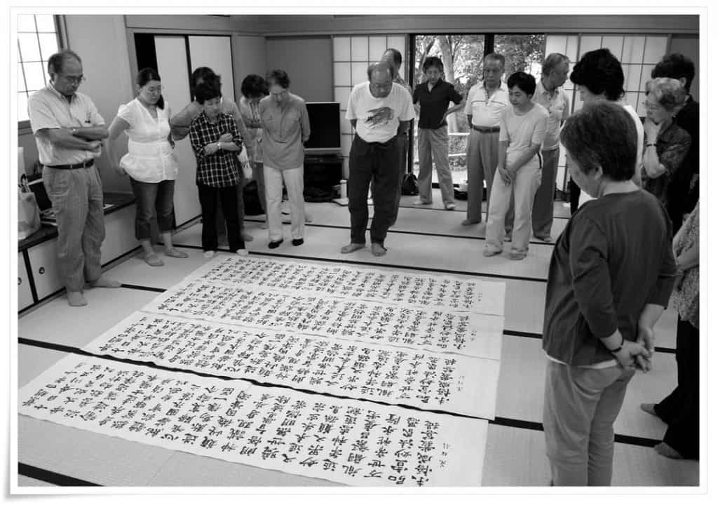
Last Saturday, I brought the works I considered worth showing to my teacher to a Community Centre in Minami Koshigaya (南越谷), Saitama Prefecture (埼玉県). It is somewhat difficult to find a large room for use in Japan, and as you can see in the pictures published in this article, the majority of the works were quite large, and their selection process required lots of space.
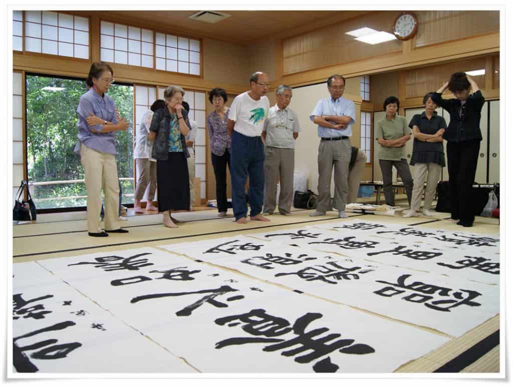
In Figure 1 you can see four rinsho (臨書, りんしょ, lit. “look and write” (i.e. to copy a masterpiece)) of one of the twenty calligraphy masterpieces carved into the rock of the famous 龍門洞窟 (Chinese: Lóng mén dóng kū), a cave in Eastern China. The original of this particular calligraphy was carved in 503 C.E. Twenty two rows of six characters each, on a large sized paper like this, takes approximately four hours to write. On this picture, you can see (middle) Master Kajita Esshū (梶田越舟先生, かじたえっしゅうせんせい) choosing one out of four works of one of the members of our calligraphy organisation. Although you see only four works on this picture, it is important to emphasise that the text must have been written at least twenty or thirty times, for the one final piece to be successfully chosen. If one calligraphy of that size is written a day, it would mean that it takes a month of writing everyday to deliver one satisfactory calligraphy.
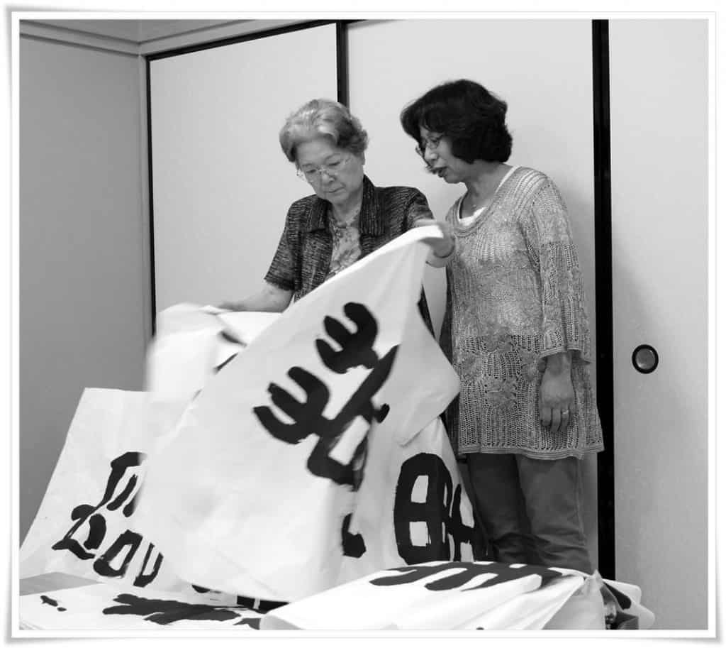
In Figure 2 you can see an even larger calligraphy (approximately 90x220cm) with various phrases. Sometimes we write one text repeatedly, as we wish to display a calligraphy that we like in particular (as in Figure 1), and sometimes we write a few different phrases and pick the most expressive one.
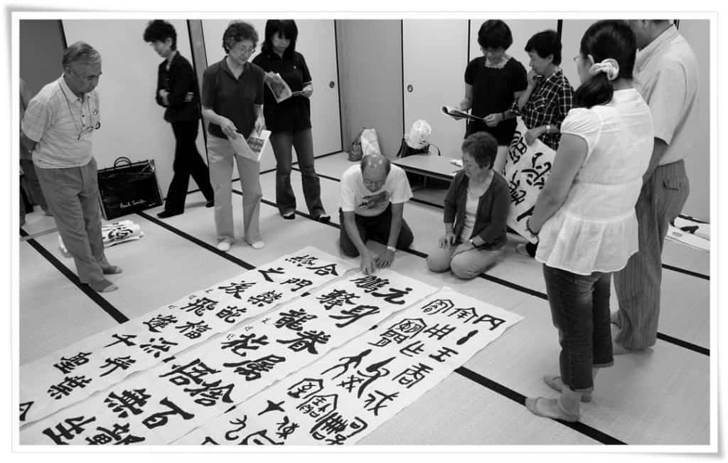
Some works have flaws, with a variety of causes. Ink rubbings (拓本, たくほん, takuhon) of ancient masterpieces may have errors, as they may have been taken from stelae whose carved text was damaged, or mistakes were simply made during carving. On the other hand, a calligrapher can make mistakes while copying such a masterpiece. In Figure 4 you can see Master Kajita Esshū pointing out an error of the kanji 鵬 (ほう, hō, i.e. “phoenix”). The double 月 (げつ, getsu, i.e. “moon”) is missing three vertical strokes. Calligraphic forms of the same kanji may differ greatly from one another, and sometimes it is difficult to say whether it is a defect of the ink rubbing or in fact if the given character simply appears in an unusual form.
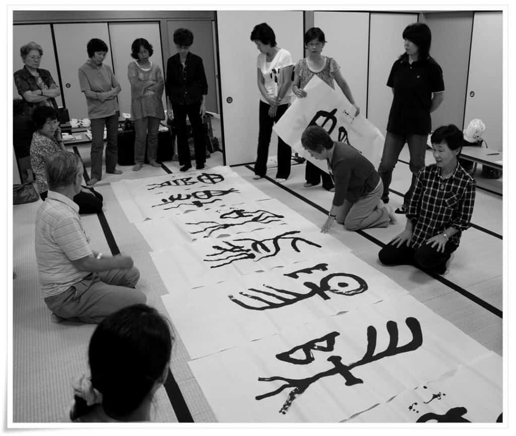
Works shown in Figure 5 are couplets, i.e. a calligraphy written on two separate sheets of paper. This tradition was initiated in ancient China. The right hand side work bears only one seal and no signature, though both are framed together. Those particular pieces are written in seal script.
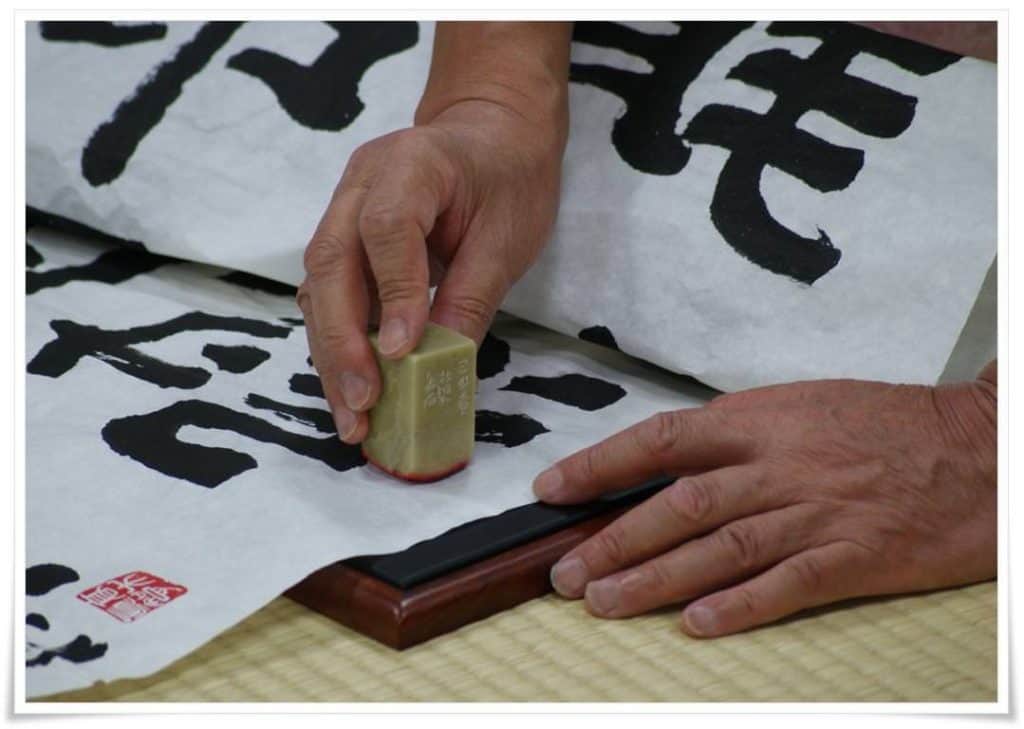
After the works are chosen, it is necessary to press the calligrapher seals onto them. Some calligraphers prefer the grand master of their organisation to do it for them. The seal impression is essential to the completed work, and takes a lot of practice to develop the appropriate skill. A badly placed seal can ruin the entire work, making it look clumsy and unbalanced. In Figure 6 you can see the seal pressing done by Master Esshū.
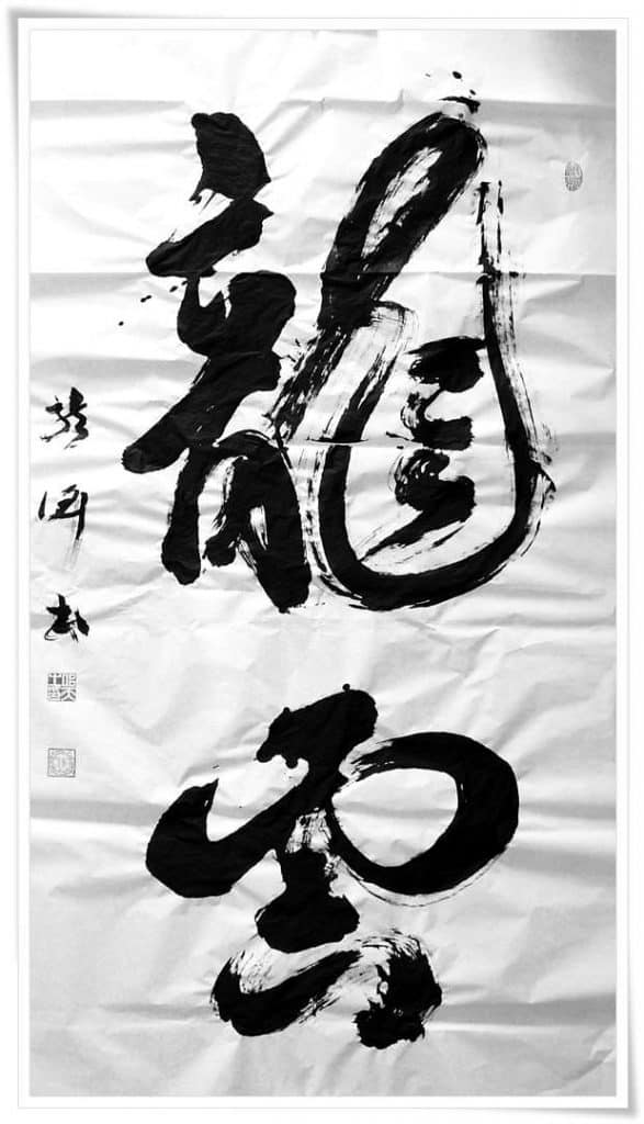
On the other hand, those who do not press their own seals do not learn from their mistakes. In my opinion pressing the seal imbues the calligraphy with its author’s personal accent, and it is as important as the writing. For this reason I choose to do it myself. In Figure 7 you see one of my works submitted for selection for the exhibition. This work was one of the two from which the final calligraphy was picked, though it is not the one that will be displayed in December in the The National Art Centre in Tokyo.
