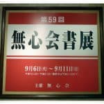
Last Sunday, on the September 11th, together with a photographer and Beyond Calligraphy website designer Dave Gosine, I visited the 59th calligraphy exhibition of 書道研究 無心会 (しょどうけんきゅうむしんかい, shodō kenkyū mushin kai, i.e. Mushinkai Calligraphy Research Organisation). 無心会 is a Japanese calligraphy association founded in 1938 by Master Tashiro Shūkaku (田代秋鶴, たしろしゅうかく、1883 – 1946). He was a very talented artist, whose life tragically ended at the age of 63. After graduating with the title of instructor from a Tokyo Music Academy, he undertook studies of calligraphy, ink painting and Chinese poetry. One of the Master Shūkaku’s calligraphy teachers was Grand Master Hidai Tenrai (比田井天来, ひだい てんらい, 1872 – 1939), who is often referred to as “the father of modern Japanese calligraphy”.

Master Shūkaku was inspired by two artists in particular. One of them was Master Nukina Sūō (貫名菘翁, ぬきな すうおう, 1778 – 1863), a Confucian scholar and a brilliant ink painter. The other one was the great Chinese master calligrapher of the Tang dynasty, Yán Zhēnqīng (顏真卿, 709 – 785). The latter one in particular influenced his calligraphy style; characterized by thick and static vertical, and thin and agile horizontal strokes.
Watching the works of the 無心会 members, I noticed that the legacy of Master Shūkaku lives on, and it continues to inspire the younger generations of artists. Look closely at works shown in Figures 4, 5 and 8 in particular, where the airy and light strokes contrast with the massive and still counterparts (Figures 5 and 8 appear in the Part 2 of this article).

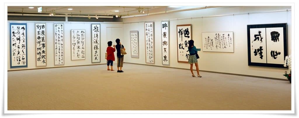
The exhibition was held in Ginza Art Gallery in Tokyo, which is quite spacious. From approximately hundred calligraphy pieces that were displayed, I picked a few that caught my attention. They should perfectly represent the variety of styles and brush techniques offered to the viewers of the exhibition.

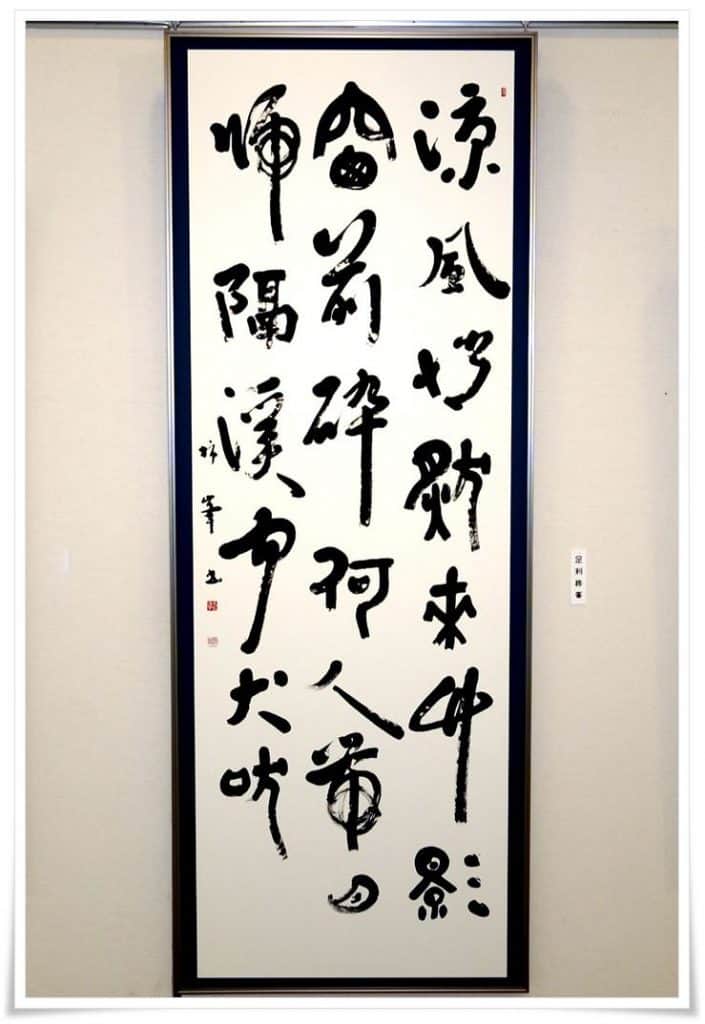
Figure 3 shows a work in a very difficult calligraphy style called 破体書 (はたいしょ, hataisho, lit “broken style calligraphy”). Interestingly enough it was initiated by the aforementioned Master Yán Zhēnqīng, over 1200 years ago. He was well known for his upright character and honest nature. His style was pure and powerful, and deviated from the rigid Tang dynasty perfectionism in its strokes. Hataisho is a blend of calligraphy scripts. It is a very difficult style, requiring vast knowledge on all five core calligraphy styles. On top of that, one needs to possess quite an artistic imagination in order to blend various scripts into one work seamlessly, and in a way that they will complement one another, without creating dissonance. The calligraphy shown in Figure 3 reads:
(Chinese: liáng fēng qiǎo rán lái)
竹影窗前碎
(zhú yǐng chuāng qián suì)
何人帶月歸
(hé rén dài yuè guī)
隔溪聞犬吠
(gé xī wén quǎn fèi)
It’s a very picturesque phrase, though please note that this is poetry, and my translation (below) is only a personal interpretation of it.
Flickering bamboo (leaves) shadows through the window
Anyone’s way home tinged with the moon (light)
A distant creek and dog’s howl (is all) that I can hear
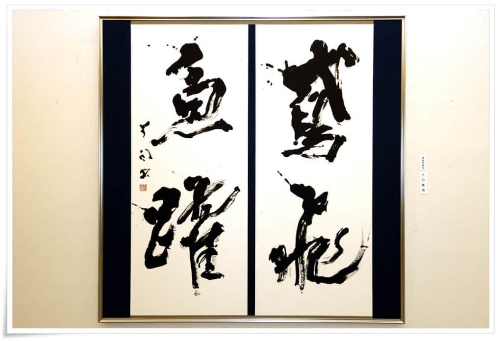
In Figure 4. you see very dramatic and dynamic brushwork. The lines are abundant in kasure (掠れ, かすれ, i.e. “streaks of white (paper) piercing through the ink”) created with a very soft wool brush (羊毛筆, ようもうふで, yōmō fude) with a long tuft. The text reads 鳶飛魚踊 (Chinese: yuān fēi yú yǒng, i.e. “a flying hawk and a leaping fish”), one of many phrases to describe the beauty of nature, often used in calligraphy.
…to be continued in Part 2

