If you learn Chinese or Japanese languages, or any other language that is based on the Chinese writing system, you will sooner or later come in contact with the living language. This is where the artificial reality of various text books will most likely fail to guide you through a jungle of nuances that create a rift between what we call in Japanese 活字 (かつじ, katsuji, i.e. “print font”, which is nothing else than a computer font that you see in any book, website or newspaper), and the traditionally hand-written Chinese characters.
Interestingly enough, even the native speakers make orthographic errors when writing things down by hand. Vast majority of young people in Japan has troubles with remembering how to reconstruct given Chinese character from their memory, and I am referring to 活字 forms here. Traditional way of writing characters is on a completely different level. By typing the entire life on PC’s, they gradually forget the patterns and compounds which compose given kanji. They are still able to read them, but you will find that many people prefer to put down more complex or less used kanji in kana (either hiragana (平仮名, ひらがな) or katakana (片仮名, かたかな), which are syllabaries of the Japanese language). It is a shame really, as hand-written Chinese characters, even if not put down with a brush but a pen or a pencil, may have inspiring forms, and can tell us so much about the author, his mood, or personality, etc.
In addition to the above, some characters may have multiple forms (as many as 7, or even more) in standard script (楷書, かいしょ, kaisho). In Japanese they are known as 異体字 (いたいじ, itaiji, i.e. “kanji variants”). Certain kanji variants of a given character may look similar to one another, whereas the other ones seem to have no visual connection whatsoever, even though they are the very same character, etymologically and semantically speaking.
Practical skill of writing characters by hand is a specialised knowledge and it is not immediately needed for everyday communication. It is also true that to comprehend how to write them correctly, accordingly to ancient traditions and the history of natural evolution of the Chinese characters, one needs to devote quite some time to study them. In fact, it is a lifetime challenge. But then again, who has the time or heart for it these days…
For the purpose of visualising the differences that I am referring to in this article, and better understanding of the subject, I have written down a few calligraphy works that you can compare against the computer font equivalents (Figures 1 to 9). It is understandable that those who study oriental calligraphy or even ペン習字 (ぺんしゅうじ, pen shūji, i.e. “pen calligraphy”, which is, in a way, much closer to the Western definition of the word “calligraphy”) are a small minority, and the rest of the people who communicate in Chinese characters based languages use only electronic media instead. For this reason one may not even need the knowledge of writing by hand. However, if you are serious about learning kanji, or simply curious about the history and traditions of the Orient, you should at least be aware of those two ever-colliding worlds.
For me, personally, the beauty of hand-written Chinese characters is eternal. It is poetry on its own, spawned by the brilliance of a human mind and creativity, inspired by the primal forces of nature. To study them, it feels like a time travel that takes me back to when the world was less corrupted, and seemed a much better place to be.
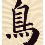
Figure 1. 鳥 (とり, tori, i.e. “bird”). Note that the hand-written form has three vertical lines in the upper part. This is a remnant of the ancient seal script (篆書, てんしょ, tensho) form of this kanji. Calligraphy by 品天龍涙 (ぽんてりゅうるい, Ponte Ryūrui), ink on paper.
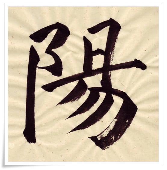
Figure 2. 陽 (よう, yō, i.e. “sun”, also “Yang”). Note that the bottom line of the 日 radical is omitted, and replaced by the long horizontal line. Calligraphy by 品天龍涙 (ぽんてりゅうるい, Ponte Ryūrui), ink on paper.
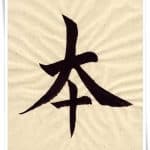
Figure 3. 本 (もと, moto, “origin”, “source” ). Etymologically, 本 shows a 木 (き, ki, i.e. “tree”) with a root, however, its hand-written form is based on the one of the clerical script (隷書, れいしょ, reisho), for which reason it differs from the computer font form of 木. Calligraphy by 品天龍涙 (ぽんてりゅうるい, Ponte Ryūrui), ink on paper.
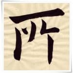
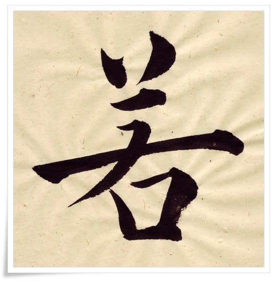
Figure 4. 若 (わか, waka, i.e. “youth”). 草冠 (くさかんむり, kusakanmuri, i.e. “grass crown”) radical can be written in many ways, but virtually it is never put down as you can see it in the computer font (i.e. longer horizontal line crossed with two short vertical lines). Calligraphy by 品天龍涙 (ぽんてりゅうるい, Ponte Ryūrui), ink on paper.
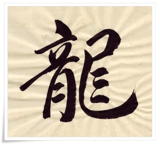
Figure 6. 所 (ところ, tokoro, “place”, “spot”). In 99% of the classic literature this character is written with a long horizontal line at the top, and a different form of 尸 is used. 所 has three different kanji variants in the standard script (楷書, かいしょ, kaisho), and the one that appears in most of the classic literature is not the same as you see in the computer font. Calligraphy by 品天龍涙 (ぽんてりゅうるい, Ponte Ryūrui), ink on paper.
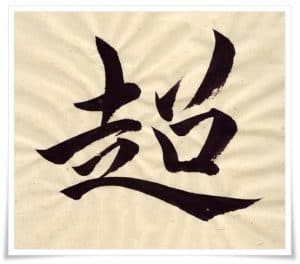
Figure 7. 龍 (りゅう, ryū, i.e. “dragon”). Although I wrote it here in semi-cursive (行書, ぎょうしょ, gyōsho) script, it still does not change the fact that the right hand side part of this kanji has a different shape, when compared against its computer font equivalent. 龍, and even its simplified version 竜, do appear in the classic literature, although they are much rarer. Shown hand-written form has no equivalent in computer font shapes. On the other hand, there are more standard form variants than just 龍 and 竜. Calligraphy by 品天龍涙 (ぽんてりゅうるい, Ponte Ryūrui), ink on paper.
Figure 8. 超 (ちょう, chō, i.e. “super”, “exceeding”, “beyond”, etc. ). It is very common that the bottom part of the radical 走 (はしる, hashiru, i.e. “run”) is written in a similar way to 之 (これ, this, i.e. “this”), with the extended sweeping stroke. Further, you can see that the刀 (かたな, katana, i.e. “sword”) was replaced by a dot and a slanting stroke. Calligraphy by 品天龍涙 (ぽんてりゅうるい, Ponte Ryūrui), ink on paper.
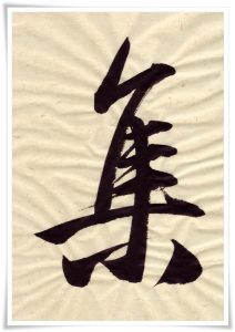
Figure 9. 集 (しゅう, shū, i.e. “compilation”, “collection”). This is a semi-cursive script (行書, ぎょうしょ, gyōsho) from of this character. Nonetheless, the significant change that also appears in great majority of the standard script forms (楷書, かいしょ, kaisho) is the bottom part of this kanji. Etymologically speaking, the ancient form of 集 was depicting three birds (隹, ふるとり, furutori, i.e. “old bird”) sitting on a tree 木 (き, ki). However, the hand-written form is based on the clerical script (隷書, れいしょ, reisho) form of 集, and the roots of the tree (the left and right bottom parts of 木) are replaced with two dots, instead of two long slanting strokes. Calligraphy by 品天龍涙 (ぽんてりゅうるい, Ponte Ryūrui), ink on paper.
