As promised in the conclusion to Part I of this article, we will now discuss colour management. Colour management is a workflow to control colour representation across all devices in the imaging chain. Most times the imaging chain starts with the camera and usually finishes with your printer.
To control the colour, the colour management software creates profiles for all your devices. These profiles provide a description of each device’s gamut. A gamut is the range of colours that a particular device can capture or show. Your camera has a specific gamut of colours that it can capture, just like your monitor has a specific gamut it can show, while your printer has a particular gamut it can print and finally the paper has a particular gamut it can reflect. The problem is these entire gamuts are different, just like your eye has a different gamut than the devices. I hope this makes sense as we are moving into the complicated stuff now.
You take a photo of your calligraphy’s red seal impression; the camera decides to place the red at the extreme end (100% red) of the camera’s gamut. Now, as I have pointed out before, 100% red does not mean anything as there are many 100% reds in the world. So to make that information mean something we need to know a specific colour red that value corresponds to, so we map the colours in the photo into something called a colour space. A colour space is a standard that defines a specific set of colours. When we map the colours in our photo to a colour space then the colour values have specific meanings. This is nothing new as it’s been happening in the background every time you take a photo or view the photo on the screen or print it.
The two most common colour spaces you hear about are sRGB and AdobeRGB. All cameras have the sRGB colour space, and some have both sRGB and AdobeRGB. My Nikon D700 has both colour spaces so I changed it to AdobeRGB for the larger gamut. Now at no time are the actual colour values changed in the file, only the metatag is updated to say which colour space to use when opening the file. This means I can change to a lower colour space later in time if I wish.
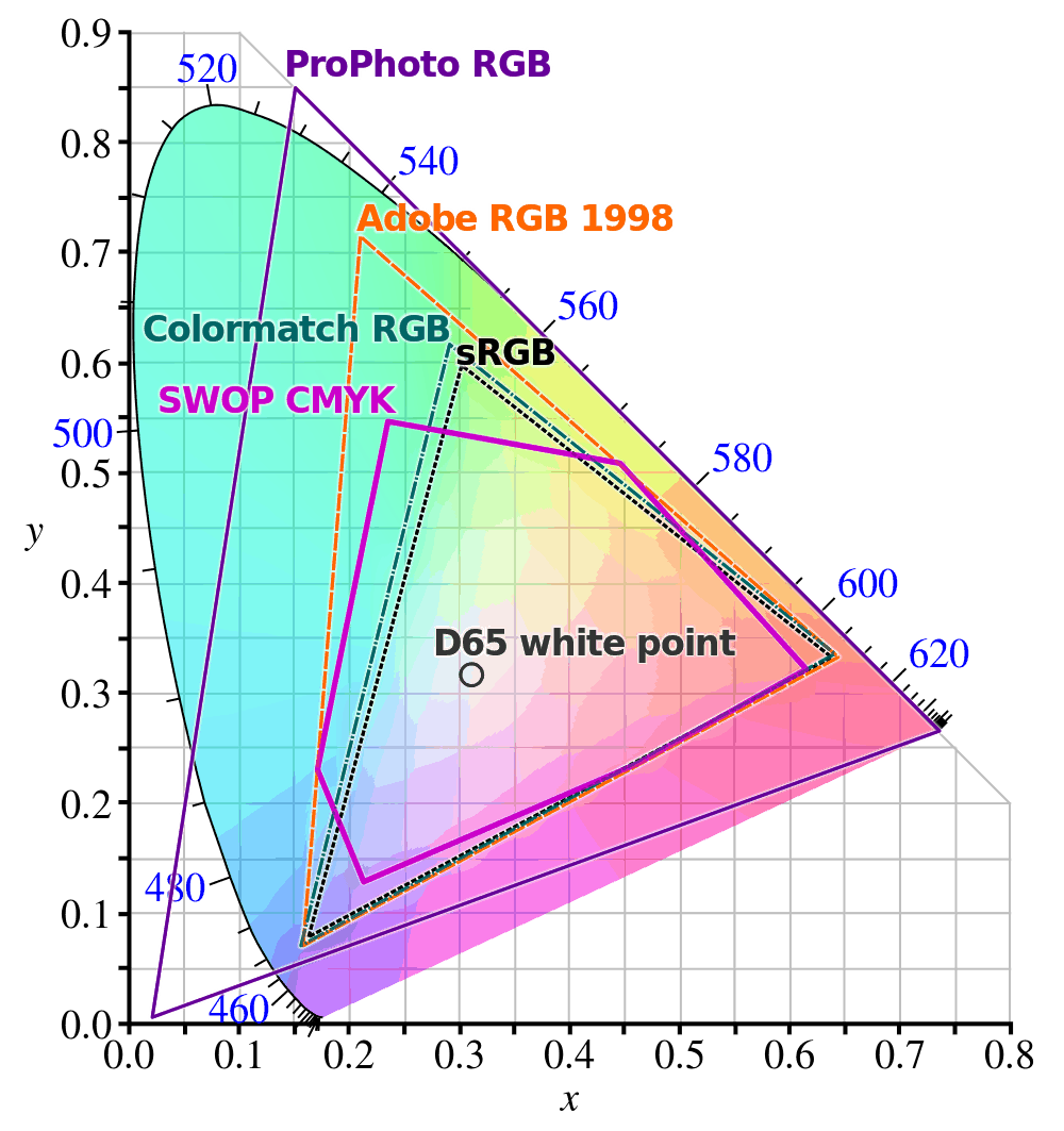
This is all good for me, but what about for you? If your camera has both colour spaces and you are willing to do extra work and pay extra money for a panel that can show the larger gamut, you could switch it to AdobeRGB and leave it. If you don’t want the extra work and upgrade to an AdobeRGB panel, than keep your camera in sRGB. So what is this extra work? Well for the most part we live in an sRGB world which means we need to convert adobeRGB to sRGB if we want to show bright colours on 98% of the viewing devices in the world. Web browsers also only show in sRGB, except Safari. Safari is colour managed so it can show AdobeRGB. If your camera or capture device can only do sRGB, keep everything in sRGB. I say this because if you map colours into a larger colour space, they spread out. You have the same amount of tones to spread across a larger range of colours. If your image has gradients (reflections, skies, etc.) those areas can develop visible bands. Also, if the difference is too great between a particular colour from a small colour space to a large colour you might see a colour shift.
Now remember sRGB and AdobeRGB are just colour spaces. You will still need to create the device gamut profile. To create the profiles, in the past you could use simple software and your eyes. The problem with that is your eyes are the weakest link. So over the years companies like Datacolor and X-rite have created devices called Colorimeter and Spectrophotometers. Colorimeters typically match human vision and measure colour targets in four broad areas. For more precise printer calibration one would use a Spectrophotometer. Spectrophotometers look at the whole spectrum and give more accurate results. I used a Datacolor Spyder in my old company, and I own an X-Rite i1. Both devices make screen calibration a lot easier.
*Remember if you are using a desk lamp, room lighting or sunlight, it can affect how the colours will look on your screen, even if your screen has been coloured calibrated.
When we move into the calibration of the camera, we have to worry about lighting and exposure. Both these factors will affect the outcome of the colour in the photo.
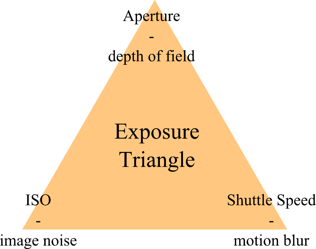
We will talk about the exposure first and keep it simple. Exposure determines how dark or light the image will appear when it is captured by the camera. The problem is that to get proper exposure you need to worry about three factors. The three factors are ISO, aperture and shuttle. (The exposure triangle). If all the factors are balanced you will get a perfect exposure and the photos will have good lighting. Now, if any one of the three is adjusted, so the ratio is not balanced, you will have a photo that is either too bright (white/overexposed) or too dark (black/underexposed). To find the correct exposure you can either chimp or use a light meter (The Sekonic L-308s is a good basic meter). I use a light meter as it’s faster and consistent (My model is the Sekonic L-758DR, it can trigger my flash system and create a colour profile).
* Chimping is a slang term photographer’s use for looking at your photos on the back of a digital camera, usually immediately after you take a shot.
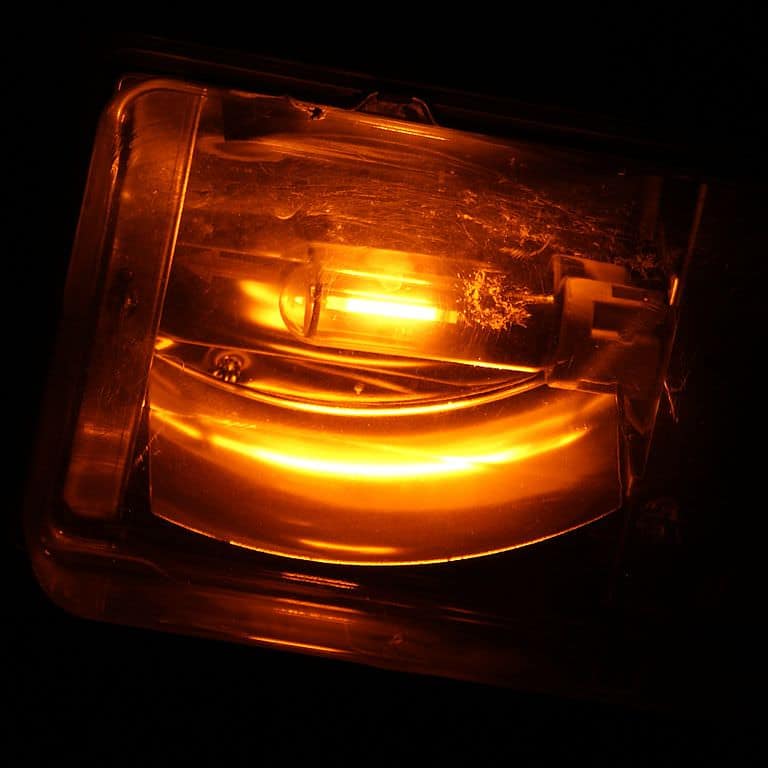
If you take your photos in daylight your colour shift will not be that bad, but when we move into the region of artificial lighting things can get really bad. Example: a photo taken under orange sodium-vapour lighting would more than likely make everything look yellowish – orange, and this is because of the broad spectrum. No matter what you did, you could not get any colour to show correctly as the light spectrum is just so broad. If you took photos under fluorescent lights, skin tones will have an unnatural greenish colour to them, but this can be corrected by filters or by the white balance function on the camera. The reason one can correct this problem is because florescent lighting has a wider spectrum than the sodium-vapour lighting.
Above I mentioned the camera’s white balance function. So what is white balance? White balance is the process of removing the colour cast from lighting so that objects which look white to the eye stay white in the photo. This is not an easy task even with the best cameras on the market. We generally do not notice these differences in colour cast as our eyes automatically adjust for it unlike cameras which need help.
To understand how white balance works we need to learn about colour temperature, and tints. The colour temperature terminology is a useful way of quantifying different types of light. It describes the apparent warmth or coolness of light which radiates from an object at that temperature in Kelvin. The Kelvin scale used is exactly backwards from the standard Kelvin scale we are taught in school.
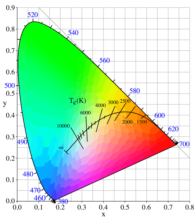
So, colour temperatures over 5,000K (kelvin) are called cool colours (bluish white) while lower colour temperatures (2,700-3,000K) are called warm colours (yellowish white through red). The reason for the scale to be backwards is because the white balance system adds colour to make up for the lack of a particular colour in the light that is shining on the object.
Now, with some light sources, the colour temperature alone doesn’t fully describe the colour cast, and a tint adjustment is also needed. Similar to how colour temperature specifies the relative warmth or coolness of an image, tint generally specifies the balance between magenta and green colour casts.
Fortunately, most digital cameras contain a variety of pre-set white balances, so you do not have to deal with colour temperature and green-magenta shift during the critical shot. To learn more about the pre-sets on your camera, just read the camera manual.
White balance is useful, but most times it will fail if there is more than one different type of light in the scene. There are a two ways to get the correct colour for the scene, one is to fix it in the camera and two is to edit the photo on the PC.
Let’s start with fixing the problem in the camera. To fix the problem in the camera, you have two options. You can either set a custom white balance or create a colour profile. I feel that the custom white balance is the quicker in some cases if your camera allows for custom white balancing, if not the colour profile might be.
To create a custom white balance you will need either an 18% grey card or a device call Expodisc. Why do we need an 18% grey card (or 12% grey card)? Because 18% grey is the middle ground between pure white and pure black. With this value the camera system will have a reference point and can calculate pure white and pure black, plus all the colours in between.
The only problem with using a grey card or Expodisc is that it’s not creating a colour profile which can be used within your colour management workflow. To create that kind of profile you will need either a colorchecker passport by X-rite or SpyderCHECKR by Datacolor. While in the mixed light situation, hold up the colour card and just take a photo of it, that’s about it, pretty simple eh. There is one more step, which is to use the vendor software and create a profile from the photo of the colour card, then apply the profile to the photos.
Now, you can do this in post-processing as long as you have some kind of software (Photoshop, Lightroom, Capture One Pro, Silkypix or Gimp, these are just a few names) which will allow you to pick a grey point on the photo. There is nothing wrong with doing white balancing in post-processing other than it’s time consuming in my opinion. For me I like to get it done in camera and spend the extra time with my family, but that’s just me.
*remember this way also does not create a colour profile which fits into your workflow.
Let me end it here as “what is colour” is a lengthy topic and I think you get my point. Colour is a complex topic and what you see might not be what other people see. Regarding the problem referred to in Part 1, in the end, the problem the calligrapher had was a local problem, which is why neither I or anyone else could not see the problem.
You can take photographs of your artwork yourself following all of the above. I say that you are able to do so with the following addition. Presentation of your work and professionalism is most important. Otherwise, no matter how high quality is the work, you will not get respect for it and someone to look closely. And taking the photos yourself will likely require more equipment than you wish to invest in. In that case I suggest you research and find an excellent professional photographer to document your work or your calligraphy performances.
If you think I might have missed something leave a comment below.