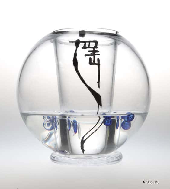
Why do we as artist, calligraphers and sumi-e painters need to understand what is colour (color) and how to add colour management to our workflow? For most calligraphers, calligraphy is just sumi (black ink) on kami (white paper), but then there are the calligraphers who go beyond basic calligraphy and sumi-e. They experiment with different mediums, specialized handmade coloured paper (ryoshi), colourful ink, write on glass or bodies or other objects, and even with writing light. For these artists, colour plays a very important role in their calligraphy as they colour becomes an integral part of the calligraphy.
Over the years I’ve told many graphic designers, photographers, and now calligraphers that it might be their eyes lying about the colour they are seeing on screen or print. Many artists become angry in the beginning with that statement but then calm down. Then there are a few who have called me a liar and said I was making excuses for not fixing a problem. One of the more interesting stories about colour happened about four years ago were a calligrapher kept complaining that I was ruining his articles because his images had the wrong colour. He went on to say “You are an IT guy, not an artist, so you would never understand about colour”. Since I’ve known him for a long time and know he is the type of person that always believes he is right, I just agreed with him and said that he was correct, I am not an artist, as his mind was already made up.
Now, if you didn’t pick it up, I only agreed to the artist part of his statement as I do not consider myself as an artist. But when it comes to colour, I do understand it more that the average person. In the early part of my career I was a Xerox System Analyst. I would speak to ma and pa printing stores as well as Kinko’s, Quebecor World and the Canadian Government about digital printing presses. See, back in the 90’s, almost all colour printing was still done on a colour press like a Heidelberg, and the colour laser printers was just getting a foothold in the world.
New colour laser printers changing the world also brought a new list of problems which I had to solve. Colour management topped the list of problems (followed by font management, another fun topic). Since I thought (yes, thought) I understood colour from my years of studying art and was trained on printers by Xerox, the first thing I did was to get certification/understanding in QuarkXpress, Corel, Photoshop and Illustrator. These were the standards used by all printing companies, and this knowledge was the missing link. So after I had all the pieces to the puzzle, I concluded that colour was one complex topic and people should stick to black and white. (joking)
What is colour?
As per Wikipedia “colour is the visual perceptual property corresponding in humans to the categories called red, blue, yellow, and others. Colour derives from the spectrum of light (distribution of light power versus wavelength) interacting in the eye with the spectral sensitivities of the light receptors.”
In simple English, if one wants to capture colour of an object they need to have a light source present. When the light shines on an object only the colours which are not absorbed by the object will be reflected. Our eyes can only see the colours which are reflected off the object. For example a red seal appears to be red because it contains pigment that absorbs blue and green light and reflect only red light. Now, that sounds simple. Eh? Let’s continue.
Light and Light waves
We have the thank Sir Isaac Newton (1643-1727) for most of our knowledge when it comes to light. His experiments demonstrated that daylight can be split into a series of colours. This sequence of colour – red, orange, yellow, green, blue, indigo, and violet, is known as the chromatic colour sequence.
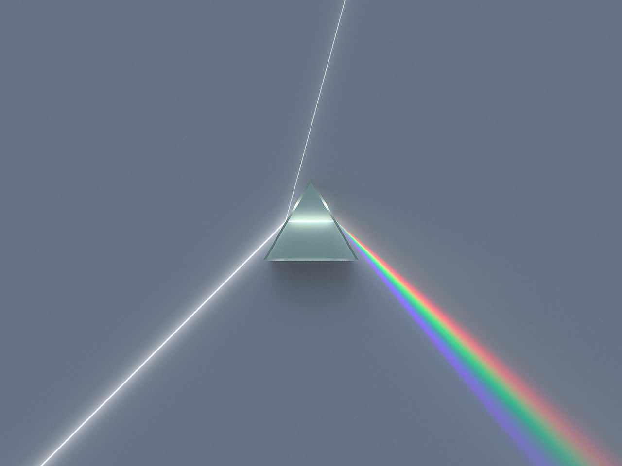
Talking about light is not an easy task as visible light exhibits properties of both wave and particles. We will stick to the wavelength and frequency properties of light since this concerns us in colour photography. As the frequency increases the wavelength decreases, and the difference in the wavelength is the colour we see.
Colour Theory
So let’s begin with the three most used terms you will see when working with colour. The three terms are Hue, Saturation (Chroma), Brightness (Lightness).
- Hue: is one of the main properties of a colour and is what most people mean when they use the word “colour”. Red, Green, Blue and Yellow are examples of hues.
- Saturation (or Chroma): is the light intensity or purity of the hue.
- Brightness (Lightness): determines whether the hue is dark or light.
A simple way of looking at saturation and brightness is that they are both modulations of the hue.
As kids growing up we were all taught to paint, be it finger paint on paper, tables, walls, or on classmates. As we grew up we learnt more about colour and some of us even had to paint a colour wheel in class (I might still have mine, will check next time I am home).
The colour theory we were taught is called the subtractive colour theory and is based on the following colours: Red, Yellow and Blue known as the painter’s primaries.
The problem with using RYB as primaries was it yields a relatively small gamut. So the printer industry changed the colours to CMY, which are Cyan, Magenta and Yellow. Combinations of different amounts of the three can produce a wide gamut of colours with good saturation. The “K” in CMYK stands for key because in four-color printing, cyan, magenta, and yellow printing plates are carefully keyed, or aligned, with the key of the black key plate.
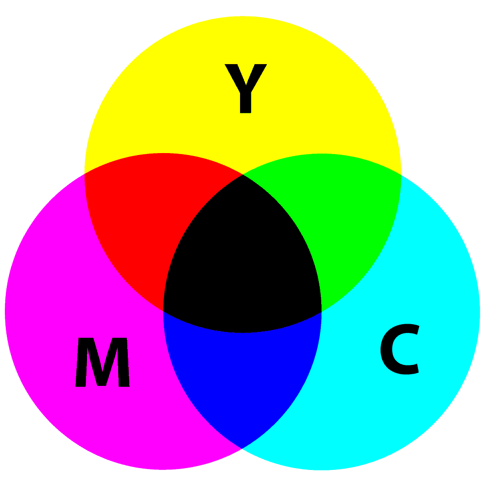
Subtractive colour theory starts with light, presumably white light, and to get black, you would combine equal amounts of cyan, magenta and yellow. Since we all grew up painting we understand RYB and the subtractive colour theory, but the problem is, unless we spend all our time painting, reading books, or dyeing hair we moving more into the world of additive colour.
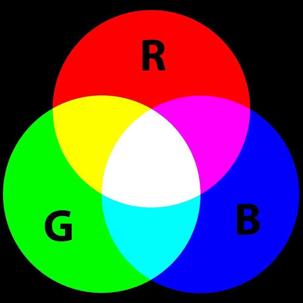
Additive colour theory starts with darkness and uses Red, Green and Blue (RGB) as its primary colours. Combinations of these colours can be used to produce all of the colours in the visible spectrum, and equal amounts of all three produce white light. The reason I say we live in an additive colour world is because smart phones, televisions, computer screens, digital cameras or any device that uses an LCD or CRT is using RGB.
Describing colour
Our vision is alright then it comes to recognizing the differences between two colours side by side. The problem starts when one has to accurately describe the individual colours to someone else.
Example: Ross asking if anyone has seen his favourite shirt.
As shown in the video, it’s a matter of personal interpretation of different hues. As for salmon colour, farmed salmon is light pink to orange where as wild salmon is rich hues of red. This is because wild salmon’s diet consists of lots of small free-floating crustaceans, such as tiny shrimp. These crustaceans are filled with molecules called carotenoids. Farmed salmon, however, aren’t fed crustaceans. Instead, they eat dry pellets that look like dog food.
Another example with describing colours normally is that it sometime gets lost in translation. In most English speaking countries we would use the colours Red, Yellow and Green to describe a traffic signal, whereas Japanese people would use the colours 赤 (あか, red), 黄 (き, yellow) and wait for it, 青 (あお, blue). Yes, they would use Blue to describe 緑 (みどり, Green) light. One of the reasons, I was told, is because in old Japanese the word blue referred to any colour between black and white. I will leave it up to you to do a google search on the topic.
Yes, a bit off topic but you see describing colour is open to massive differences in our interpretation of colour.
Now you understand basic theories of colour, but what does this have to do with calligraphy you might be still asking. Here we go.
Problem A
A client commissions you for a work of calligraphy on Ginwashi handmade paper (silver fiber paper). You receive the paper and happily write the requested calligraphy. You send a photo of the completed work to the client for confirmation. A few minutes later you receive an e-mail from the client saying that you did not use the correct paper. At this point you are confused as the image looks correct on your PC screen, but the client is saying it’s not the same. So is the problem with your camera, your screen, the file, or the client’s screen?
Problem B
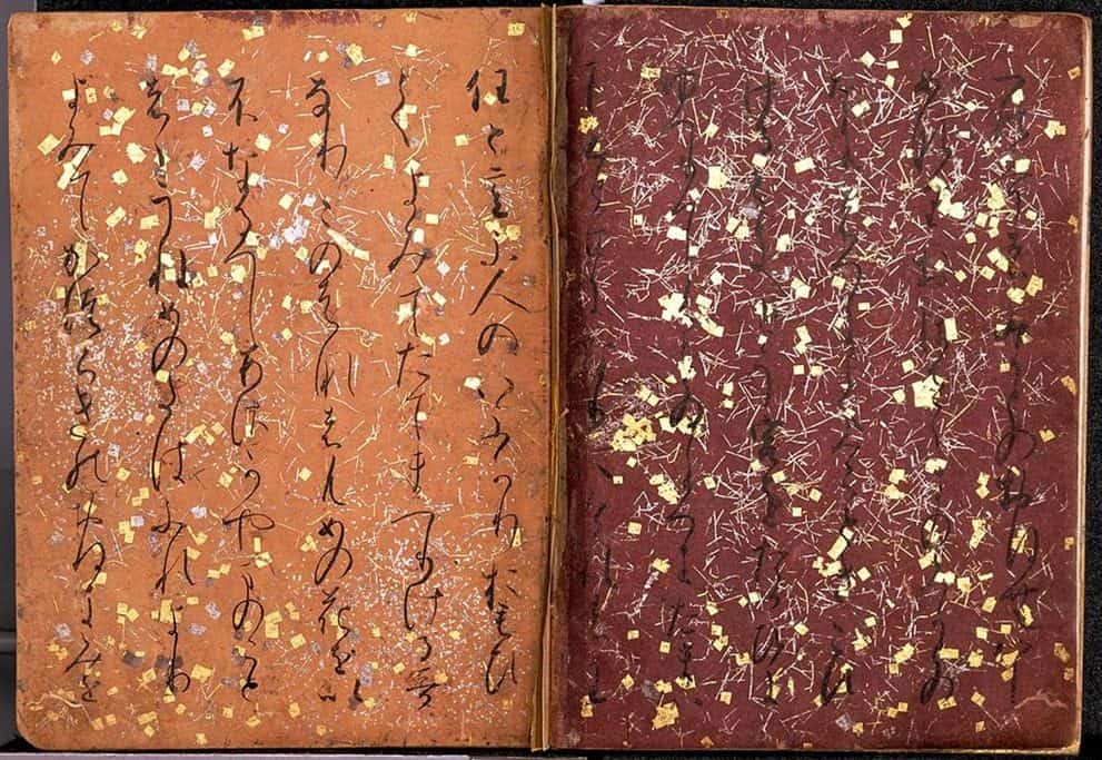
You just completed the Kokin-Wakashu on ryoshi paper using this beautiful gold ink and want to show it to the world on your blog. So you take a lovely photo and transfer the image to your PC. When you review the photo on the PC you notice that the colours are not showing. So you check the back of the camera LCD and the image looks ok. You try it a few more times, but the colours are always off. Should you just give up?
Now aren’t you glad I talked about basic colour knowledge first, as now you can make an educated guess about the problem. If you guessed that the problem is with the conversion between RYB (calligraphy) and RGB (camera and computer screen), you would be correct. So how do we fix this problem you ask? We will cover that topic next week.