Everyone has had a portrait taken of themselves sometime in their life. For most people it starts with that cute baby picture, then the school photos, your wedding day and then your family photos. Rinse and repeat the process.
What is the common thing in all those portraits, other than you being in the photo? I bet you cannot see it and since I cannot see your photos, you are wondering what I am talking about. The common thing all your portraits show, for the most part, is you looking your best. Am I right? Your hair is made up, maybe some powder or make-up for women, a clean shirt and maybe a jacket or dress. So why get dressed up?
When you were young, your parents dressed you for photos, but why continue it when you have a choice? I am guessing you wanted to leave a great impression on the people looking at the photos, Correct?
With all that said, why is it that most of you still post photos of your work which aren’t tack sharp, which are too dark, too bright, crowded by other object in the photo and not the centre of attention?
Here are 5 tips to make your photos stand out from the crowd
1. Tools – Invest in the right tools. Now don’t get silly here and spend 10,000 USD on camera equipment. Simple things like a tripod, a decent camera, foam board, a seamless white paper roll, a table and clamps/tape. (This should cost around 300 dollars. The follow-up article will have more details.)
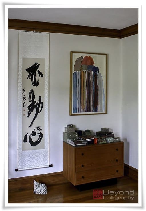
2. Background – If you use a wall to hang scrolls, make sure it’s clean. As for smaller items, use a table with seamless white paper as the background or lighting tent.
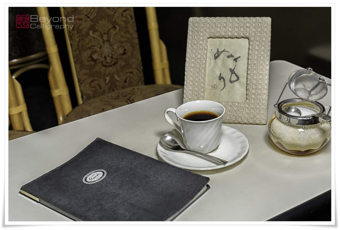
3. Context – a nice clean background is ideal to show off your art, but it doesn’t give any context. So when hanging your work on the wall, placing it over a sofa or table, context and size matter. If the art fits on a table then maybe add a cup of coffee beside it. Doing those things helps the reader/buyer have an idea of the size of the art as well as giving them an image so they can imagine where they can place your art in their home.
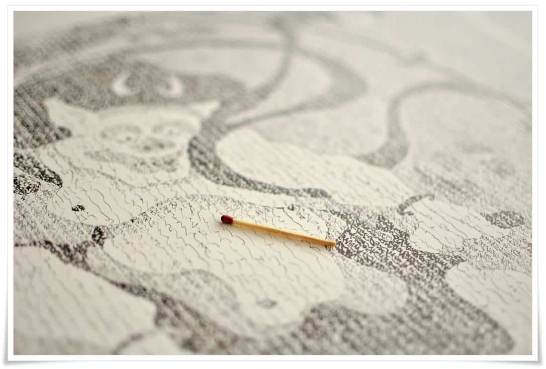
4. Details – Show the details in the art. This is especially true when it comes to using different types of paper or very small brushes. Now most people would say they do this well, but just by posting a 3 megabyte image of your work is not what I am talking about. Say you are using Unryu paper, which is traditional Japanese paper with long, unbeaten fibres embedded into the sheet. Take a close up photo which shows that detail.
5. Labelling/Sizing – When you post images of your work online always show the dimensions or some other way for people to understand the size of your work.
Always remember, they are seeing your work on a computer or other device. The better presented, the more details clearly photographed helps the reader/buyer understand what went into creating that piece of art or how difficult it was to create. Your photographs of the artwork represent the art itself. A professional presentation means that you and the artwork are professional.
If there are some points we missed please share them below.